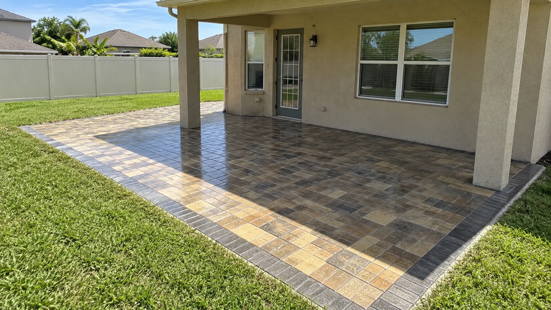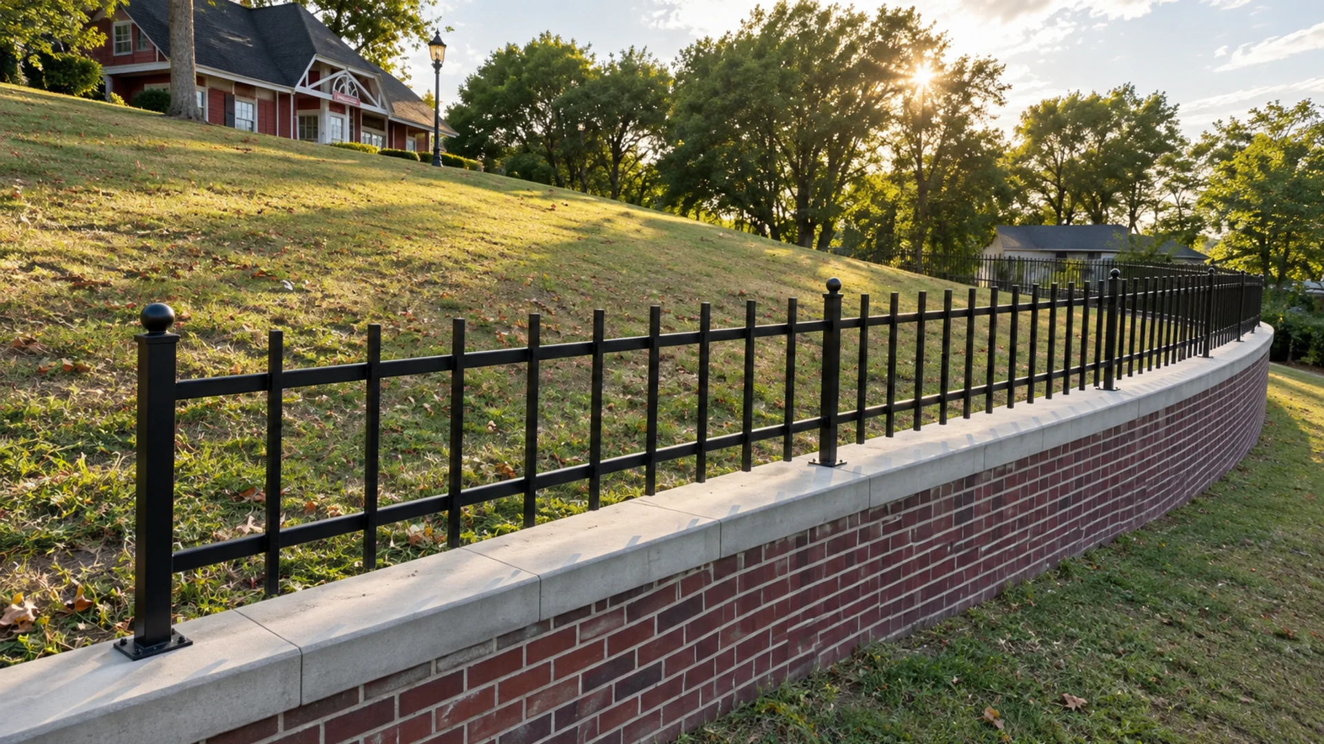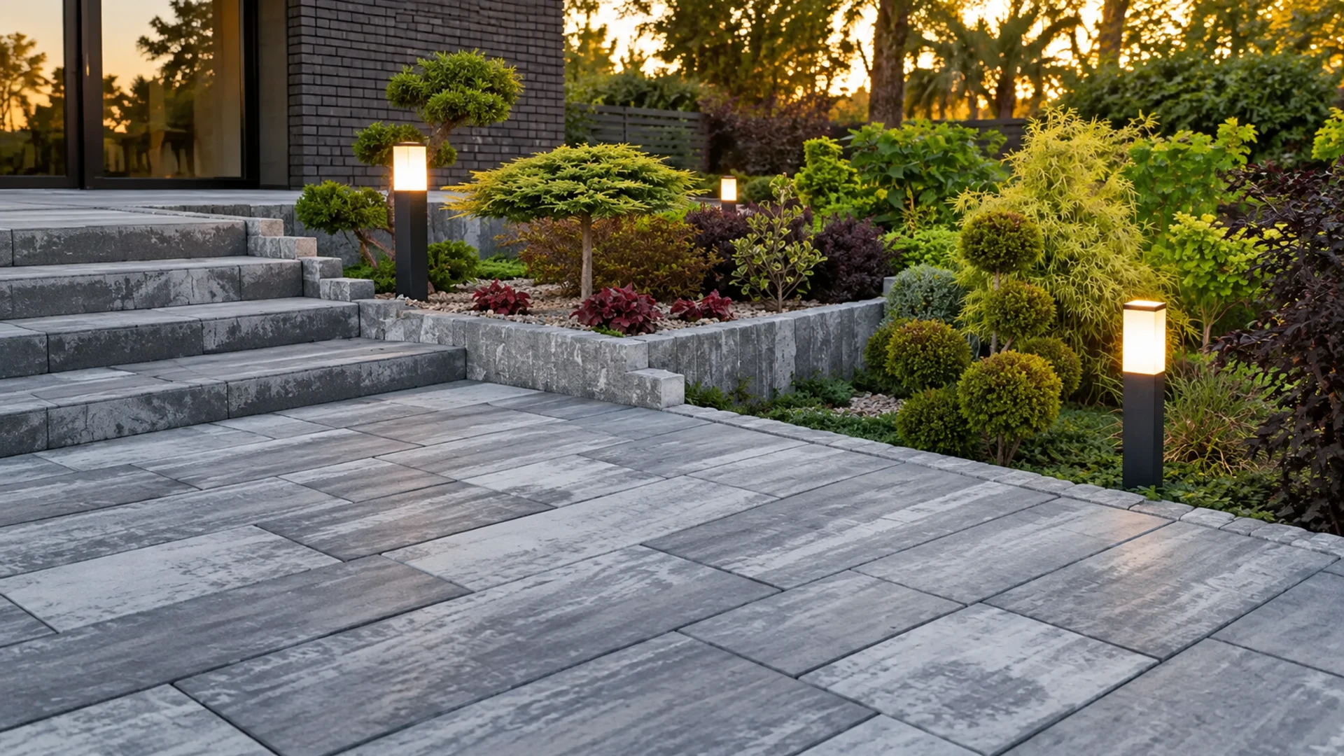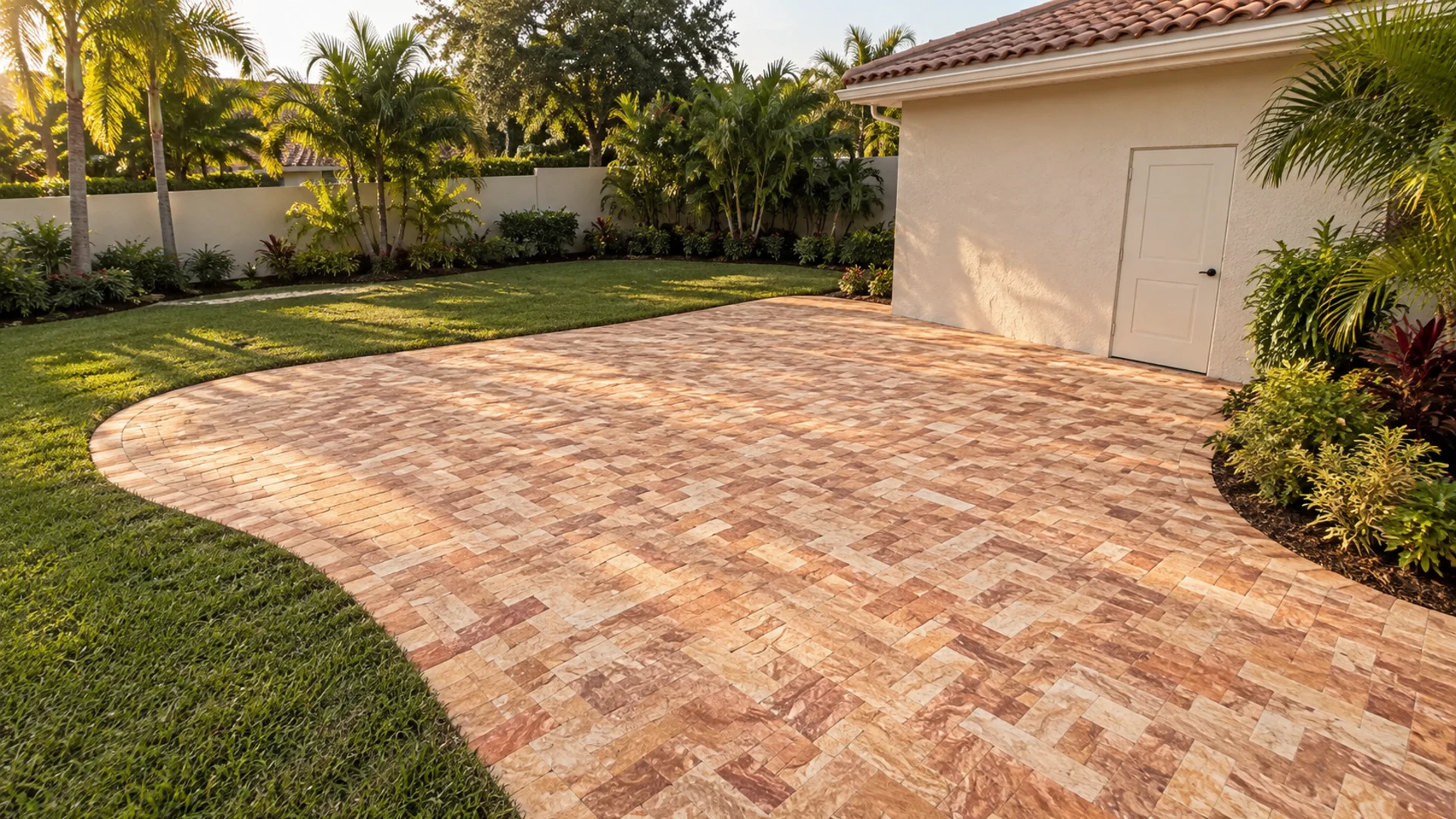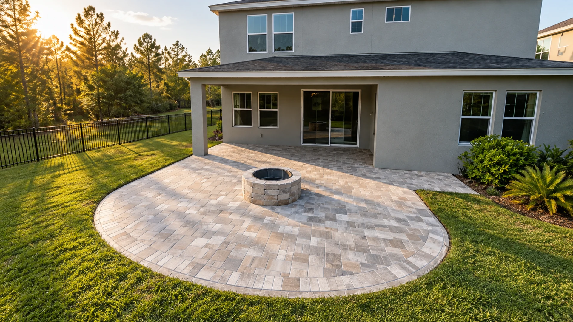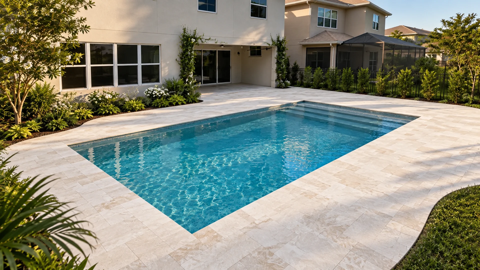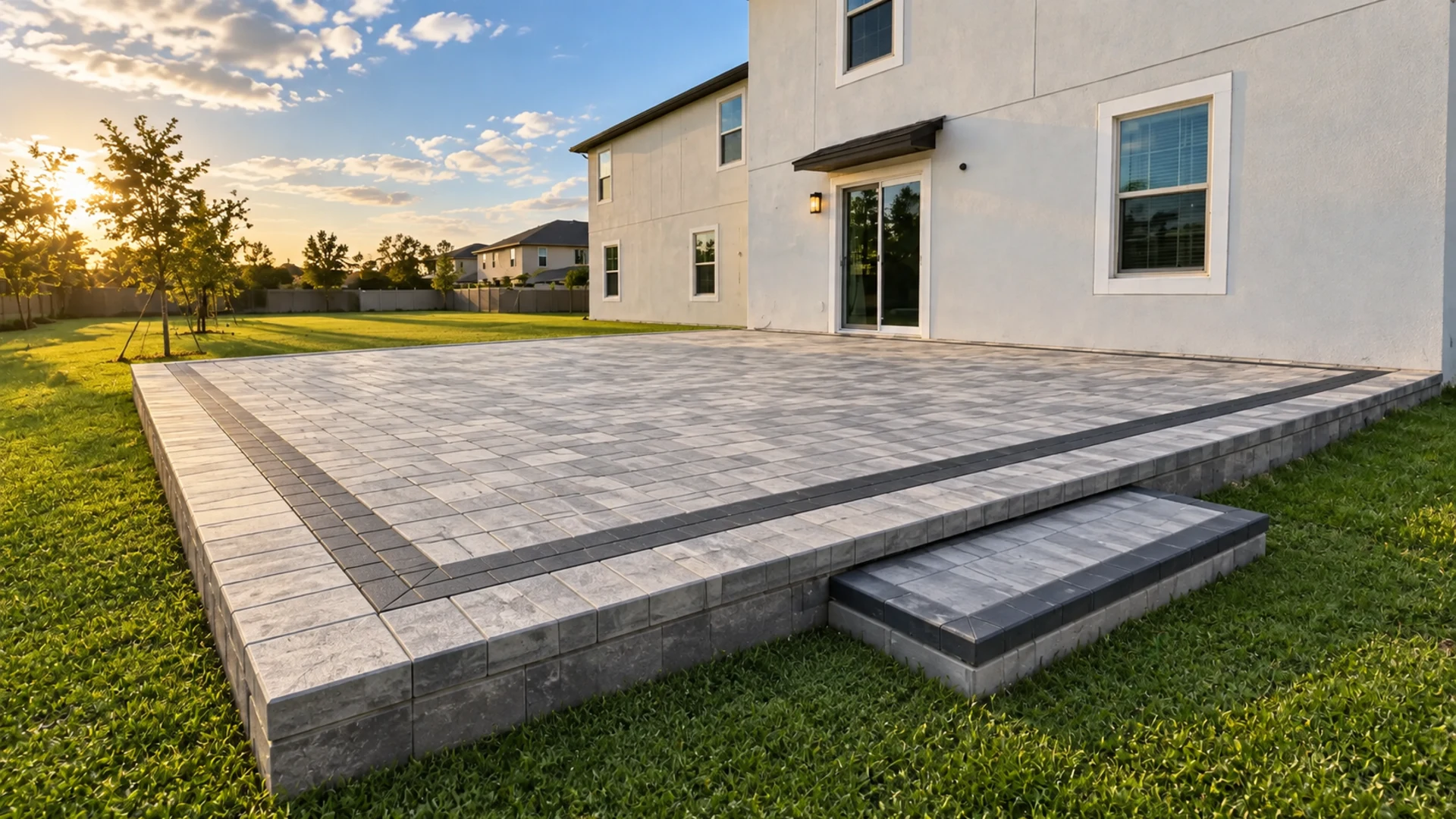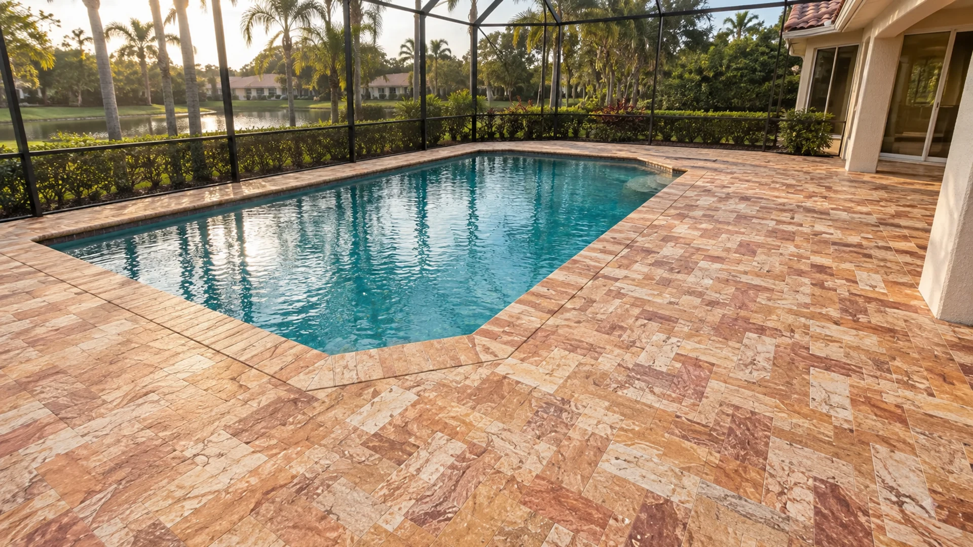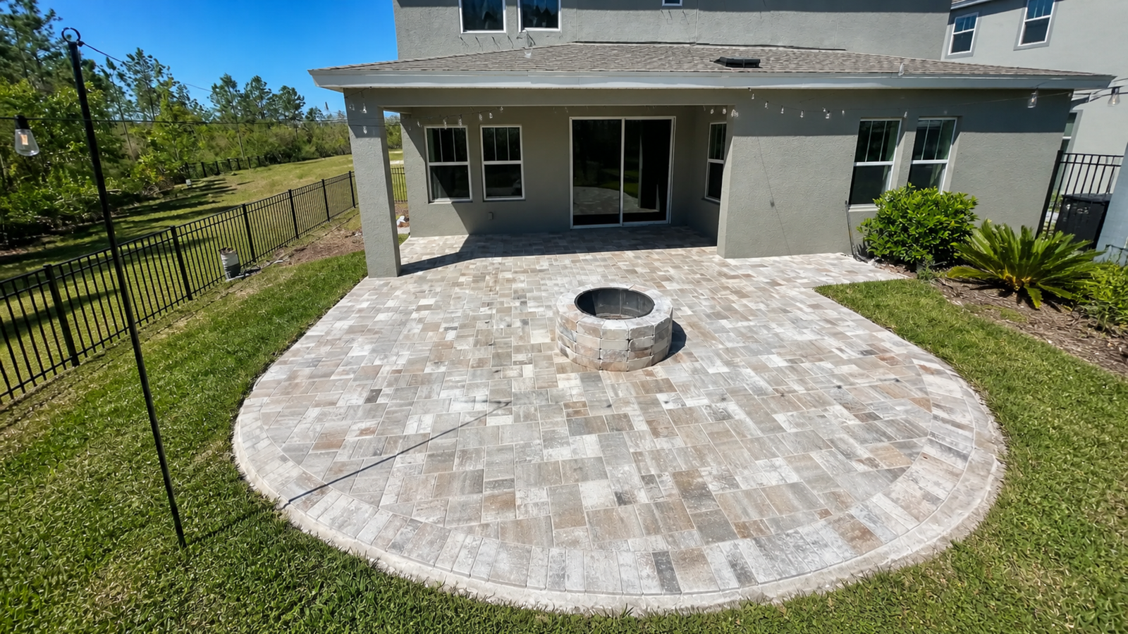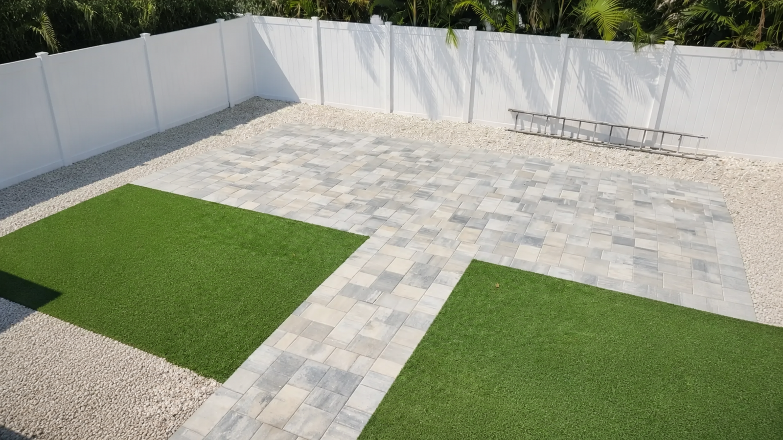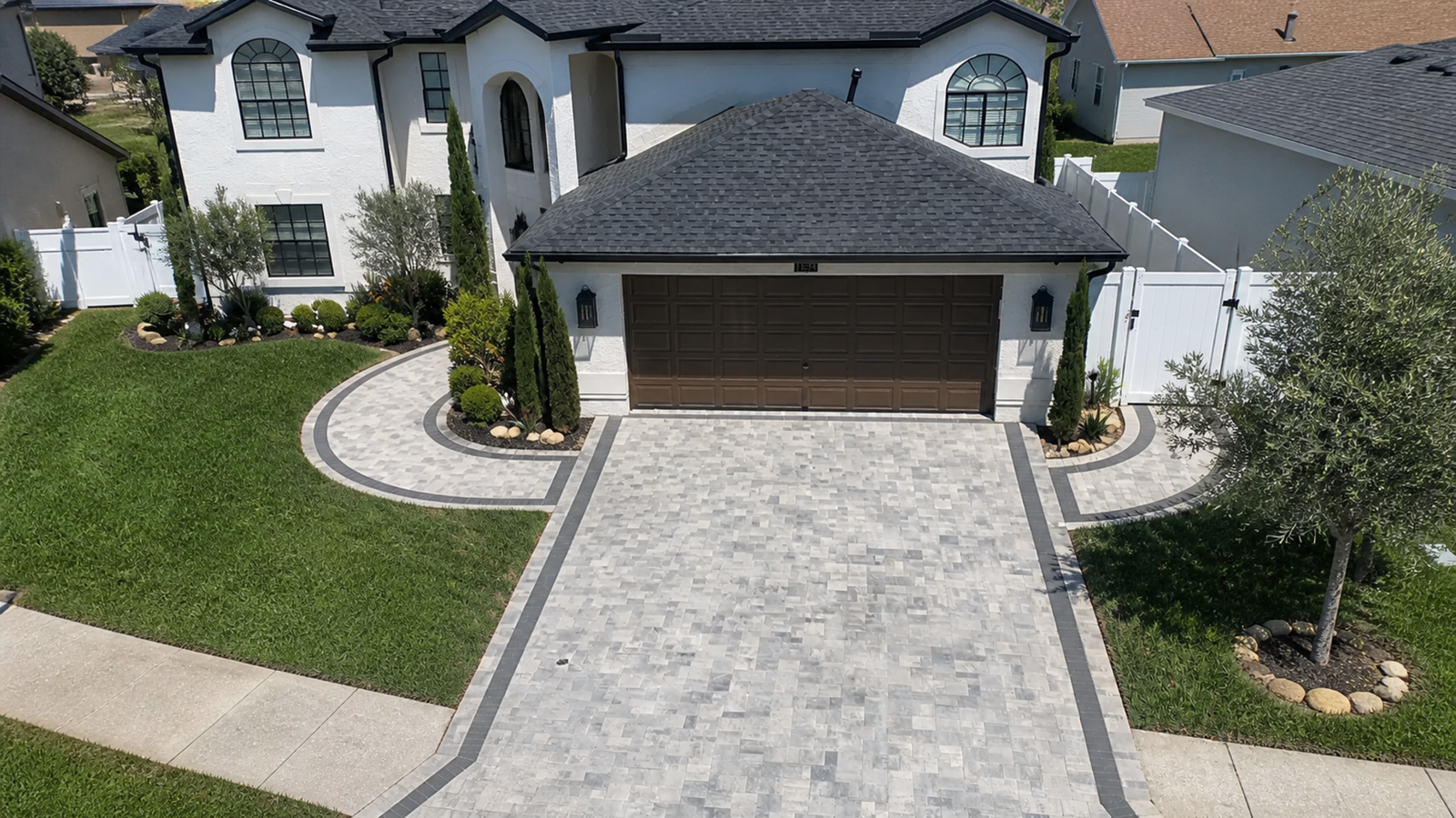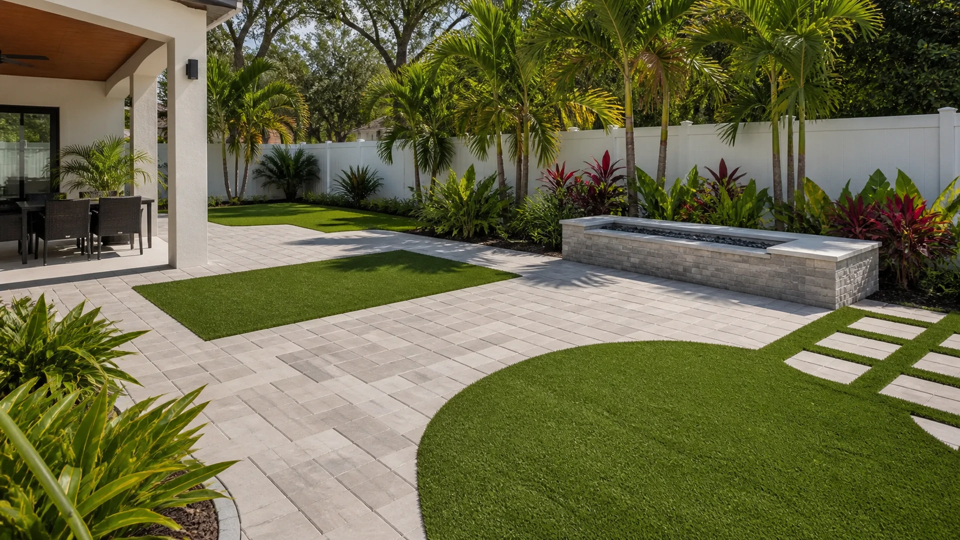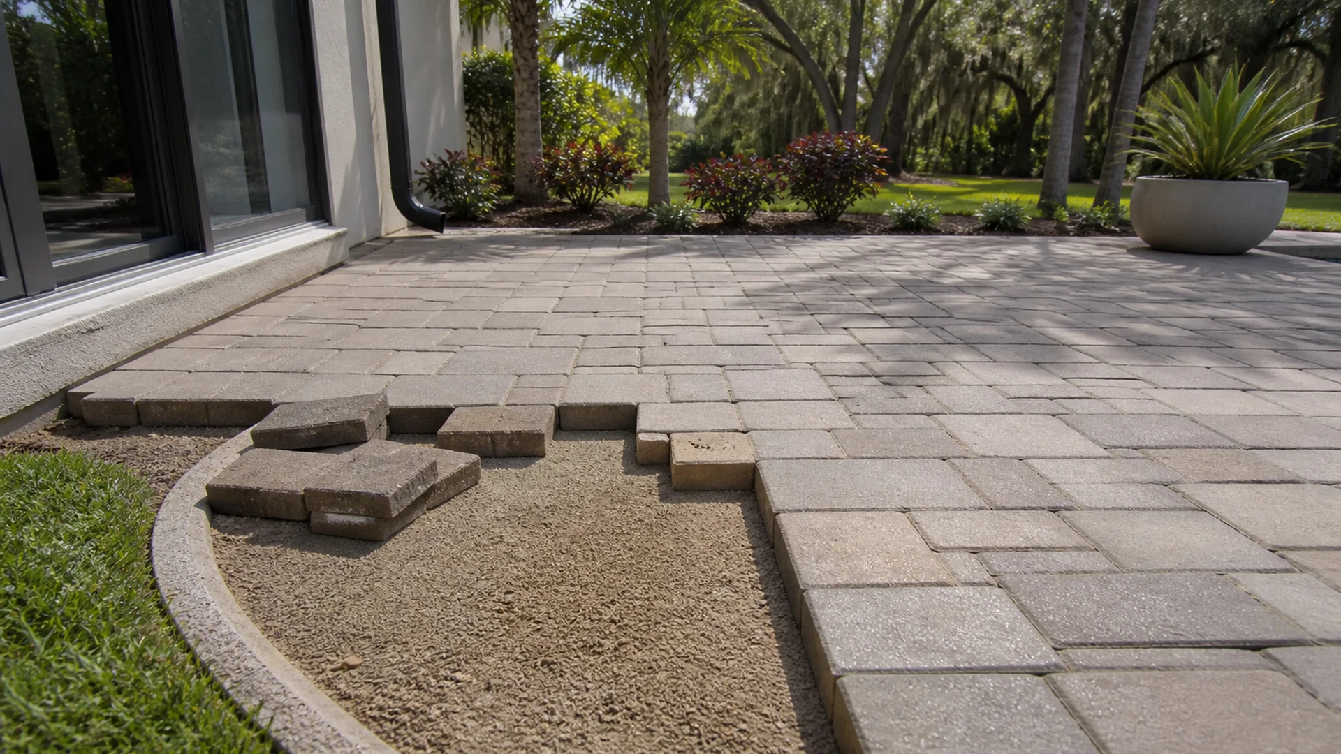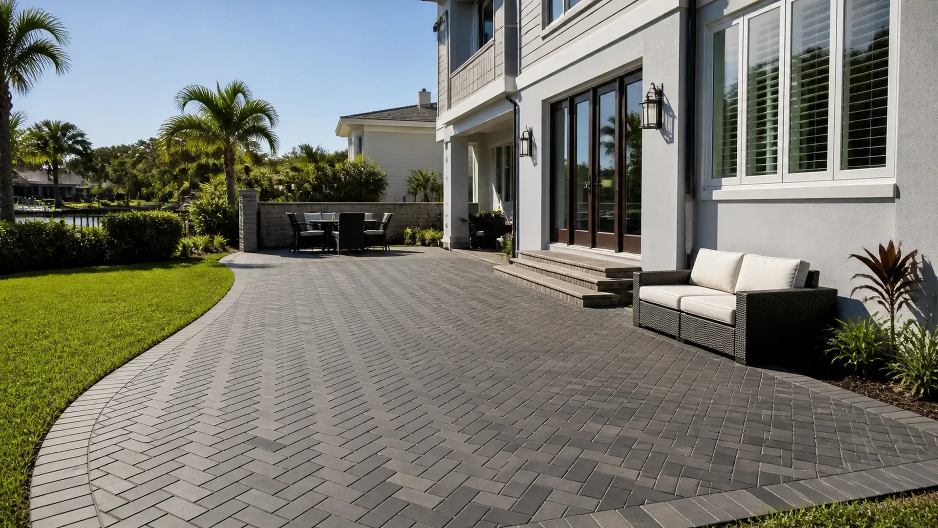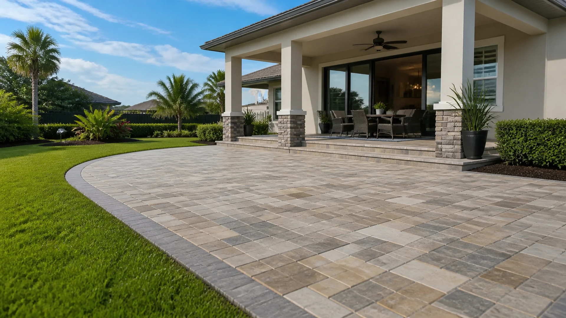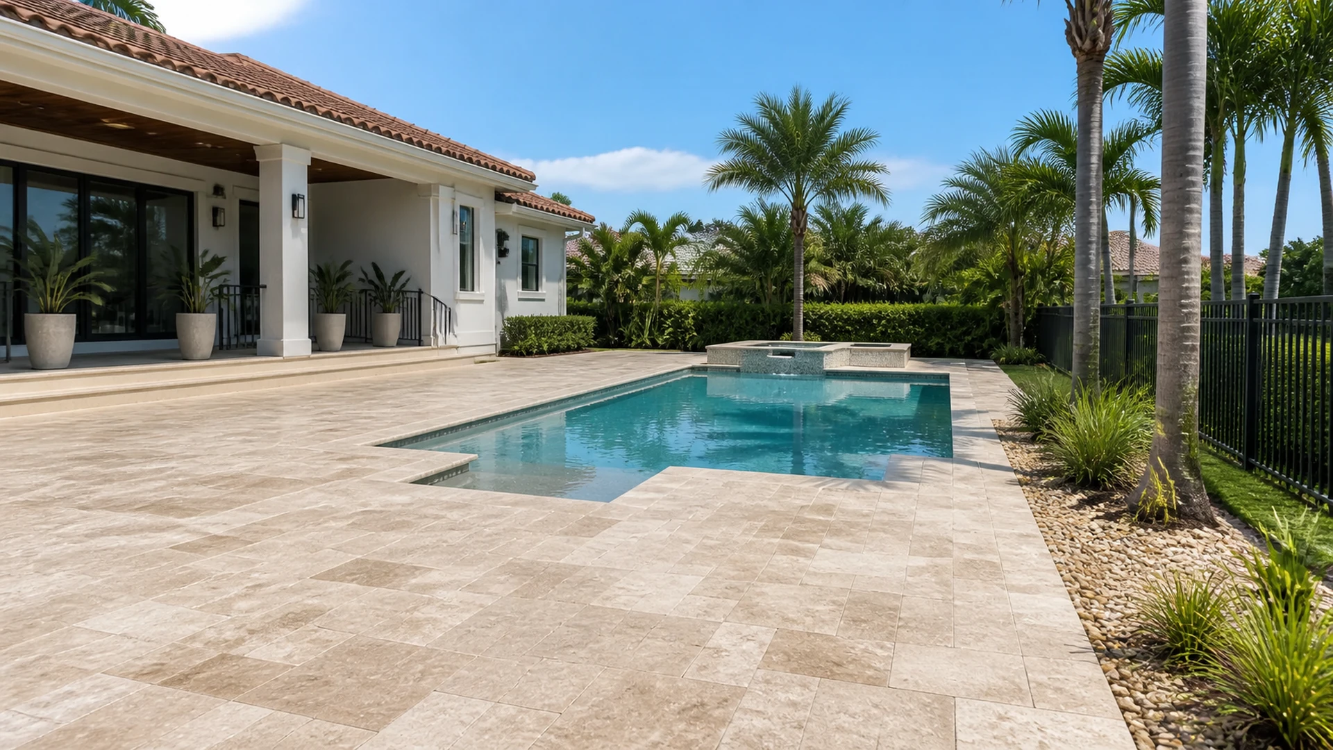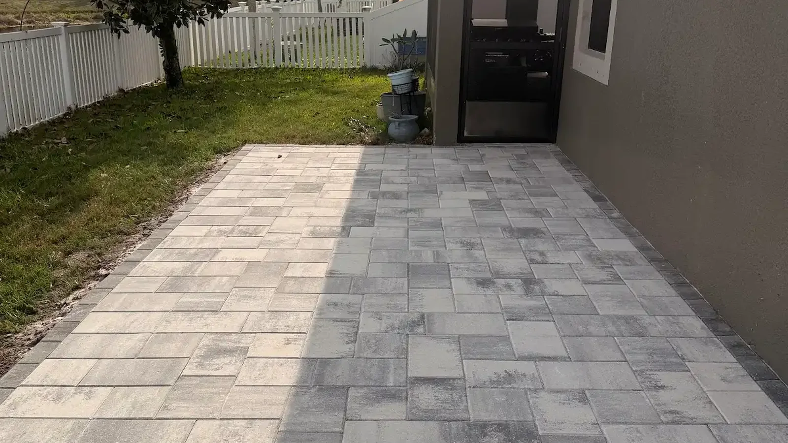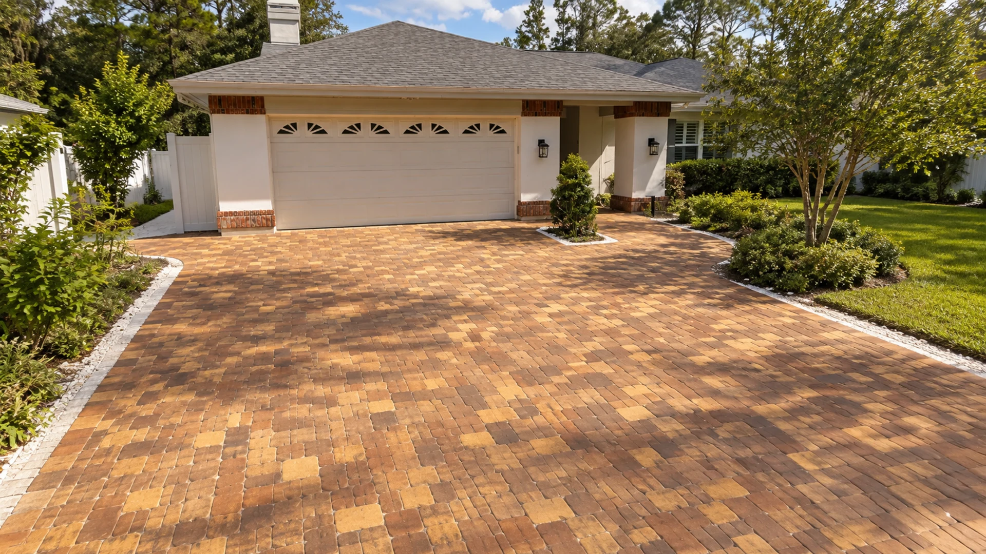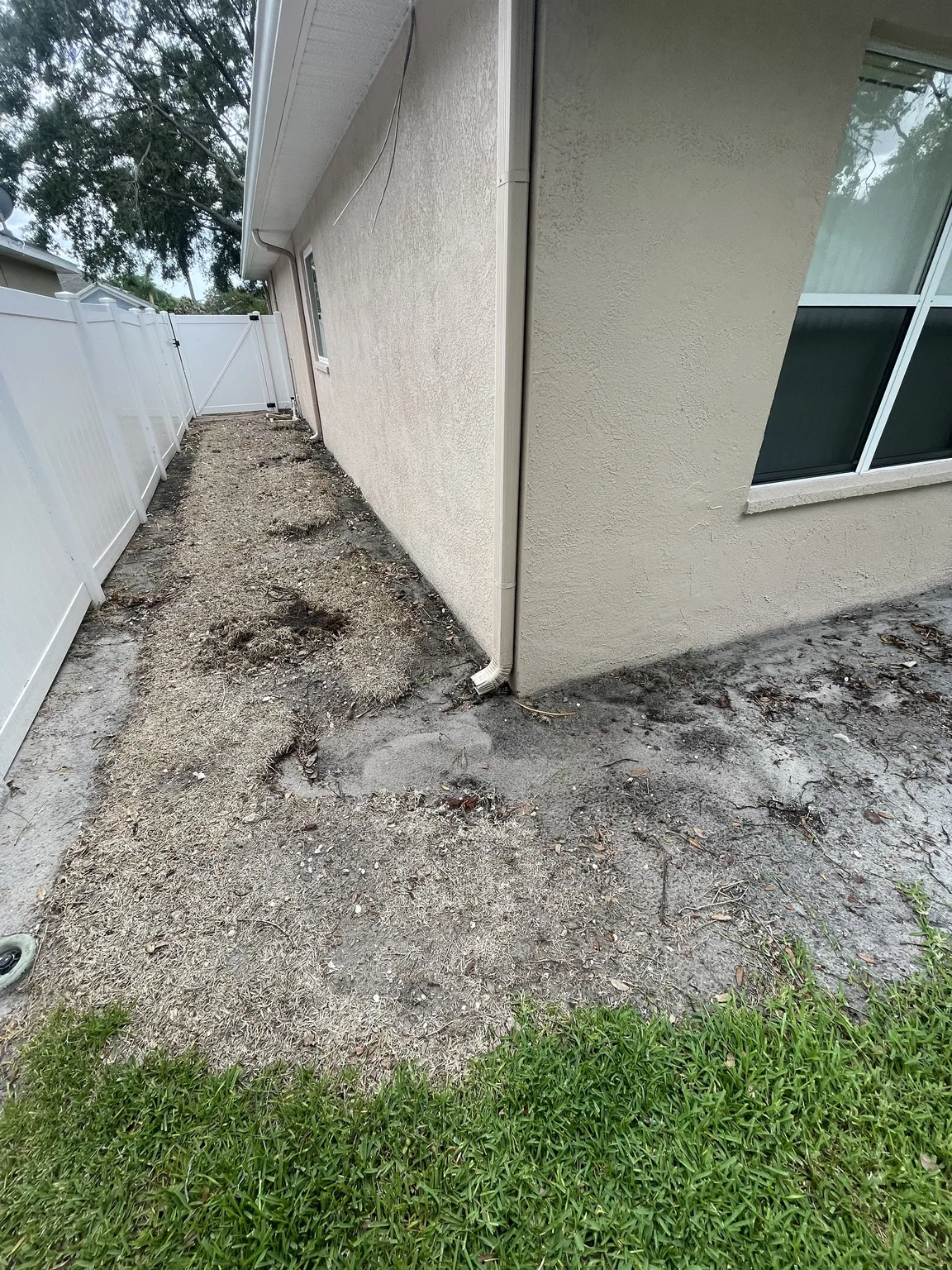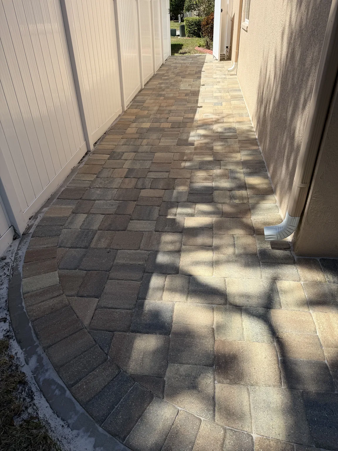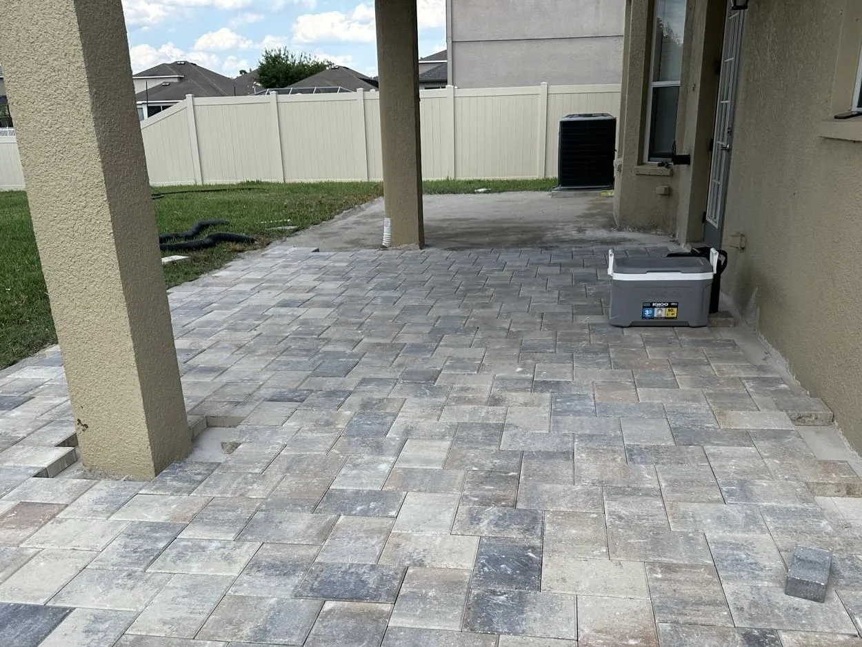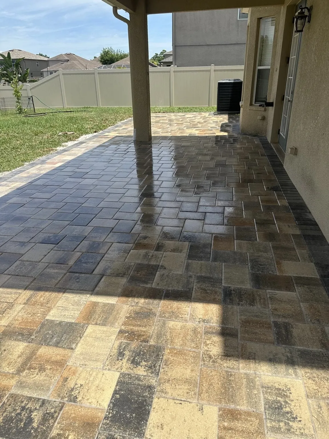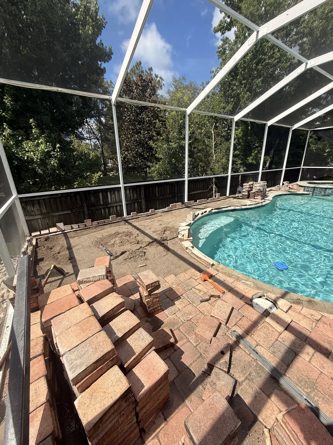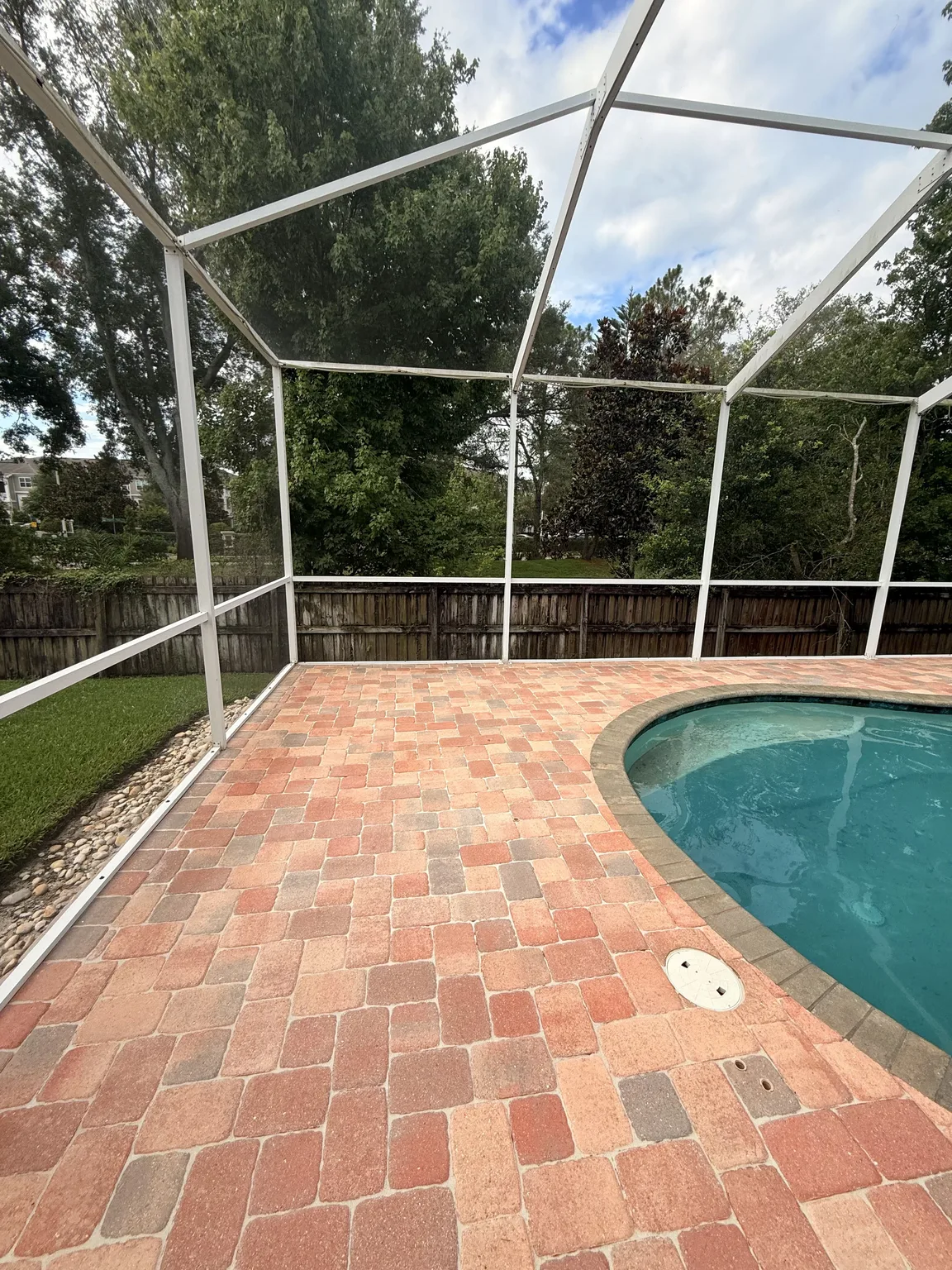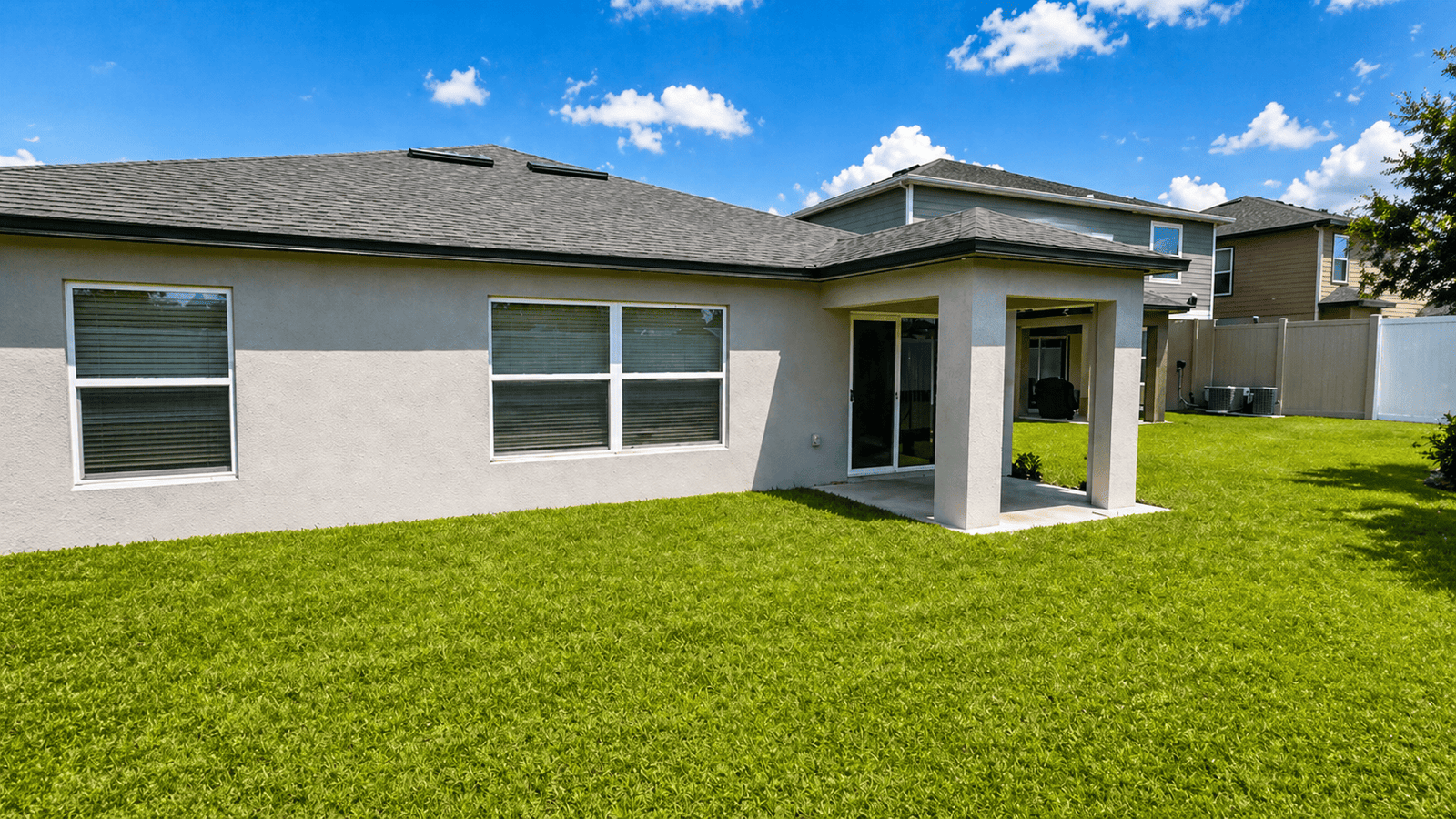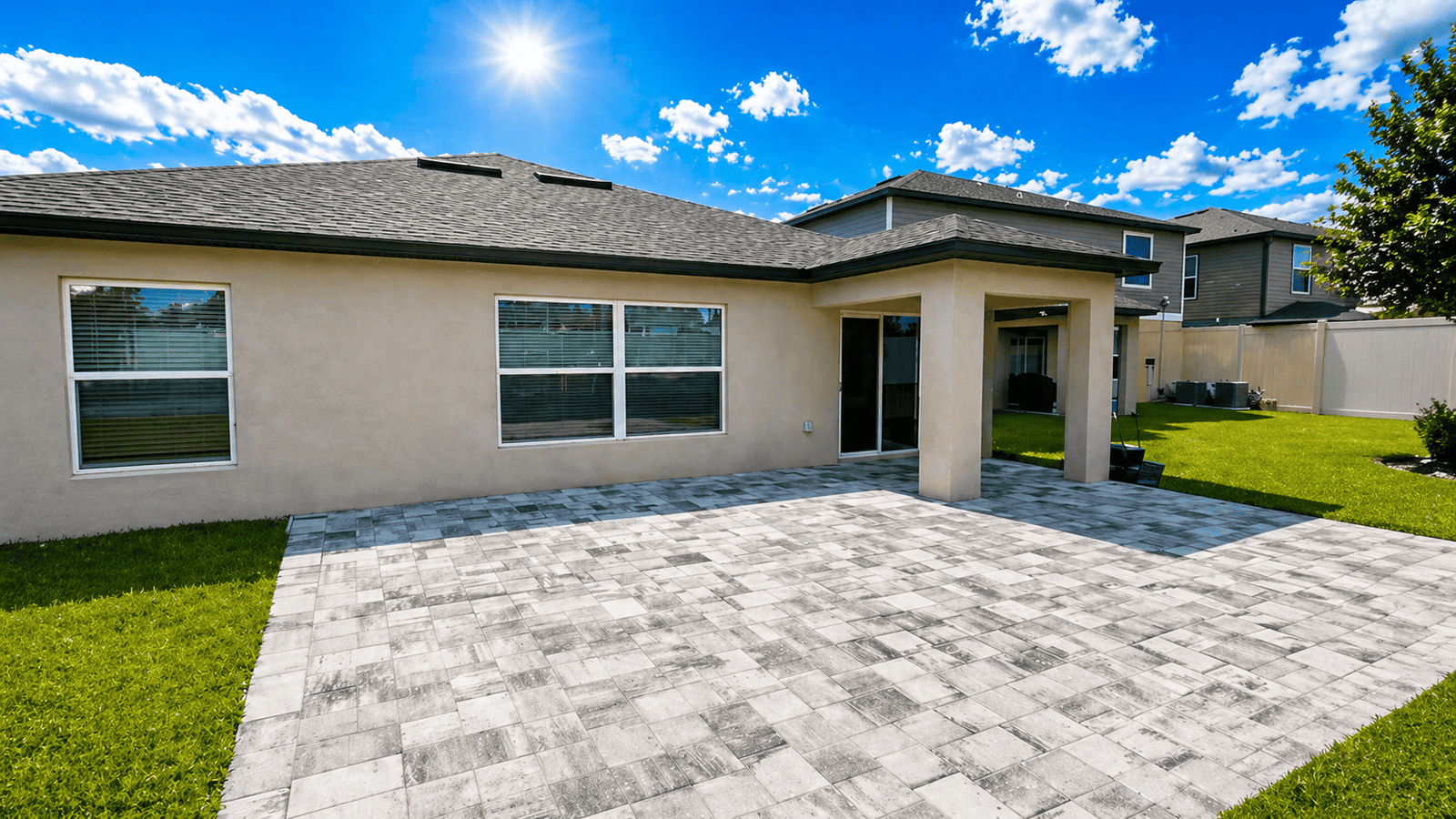

Best paver colors for a Florida home respond to sunlight, architecture, landscaping, and the way each outdoor area is used. A sample that looks muted indoors may appear much brighter under Tampa Bay sun. Likewise, a color chosen from a small brochure can read differently across a full driveway or pool surround. Therefore, a successful palette starts with the house and site rather than an isolated favorite swatch.
Color also shapes how homeowners notice sand, leaves, tire marks, water, and everyday wear. However, there is no single shade that hides every condition or complements every property. Roof tone, exterior paint, stone accents, neighborhood context, and garden colors all influence the result. This guide offers a step-by-step way to narrow the options without relying on a trend that may not fit the home.
Best paver colors begin with the fixed features
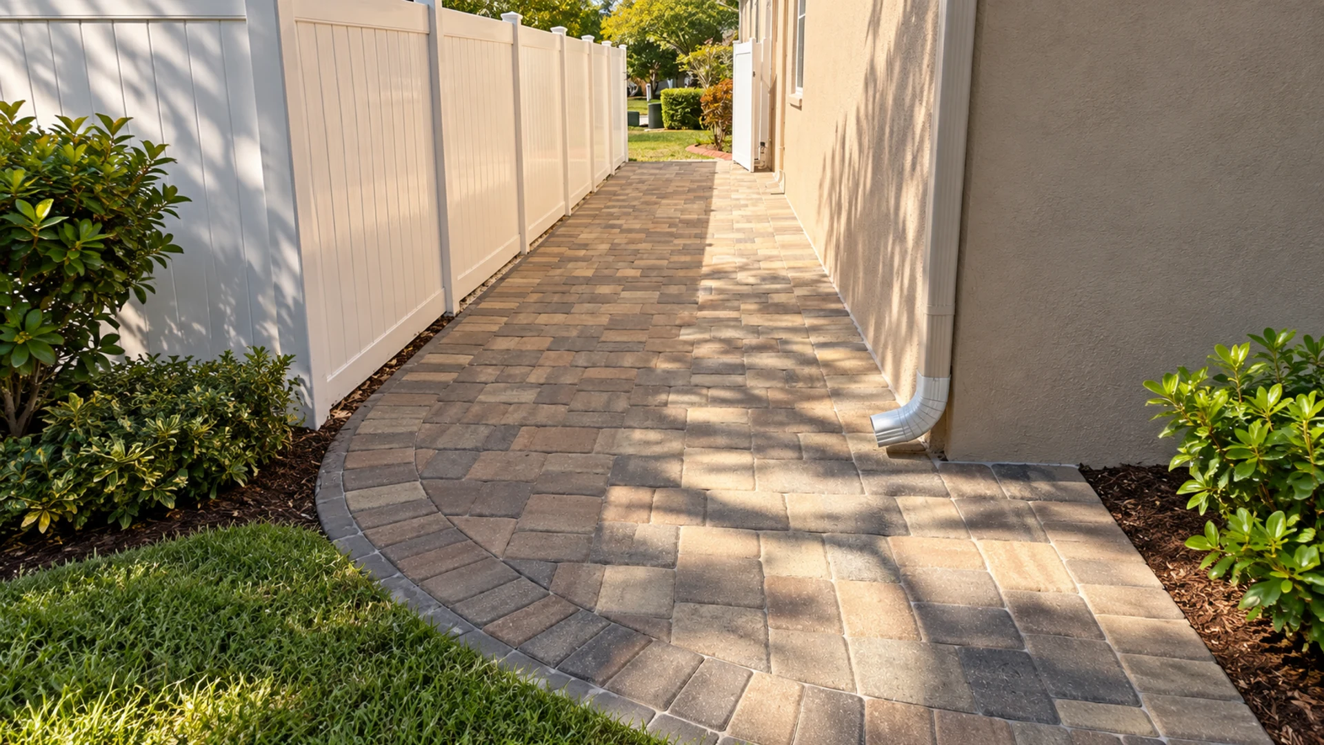
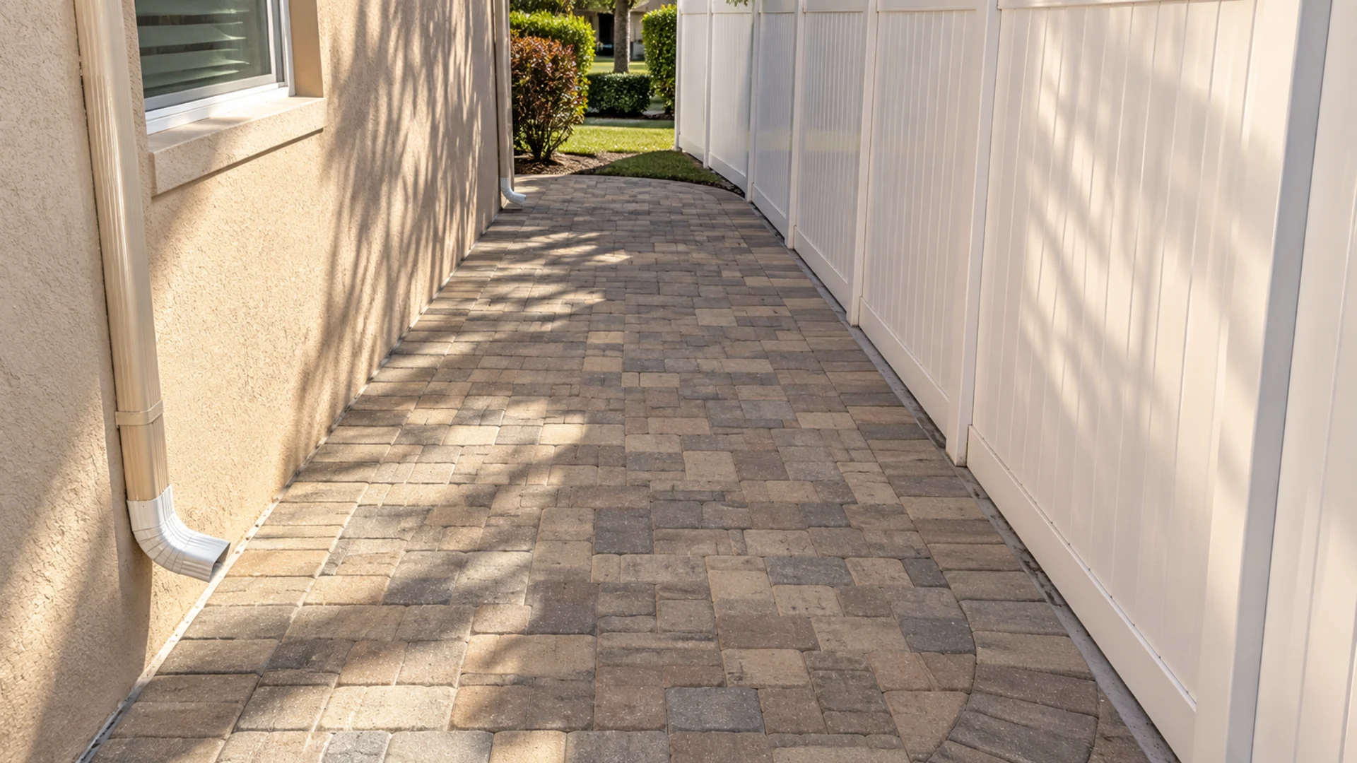
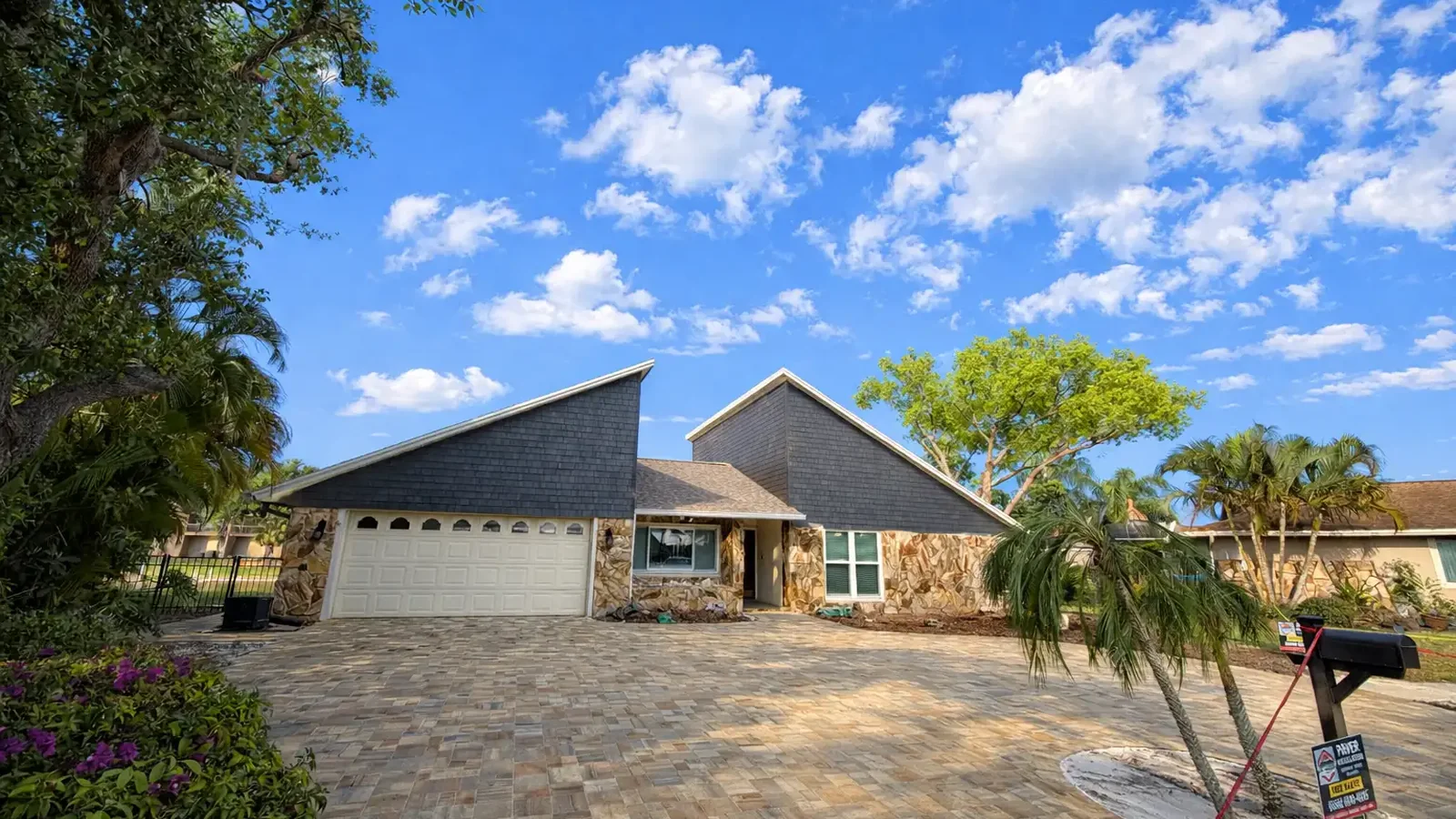
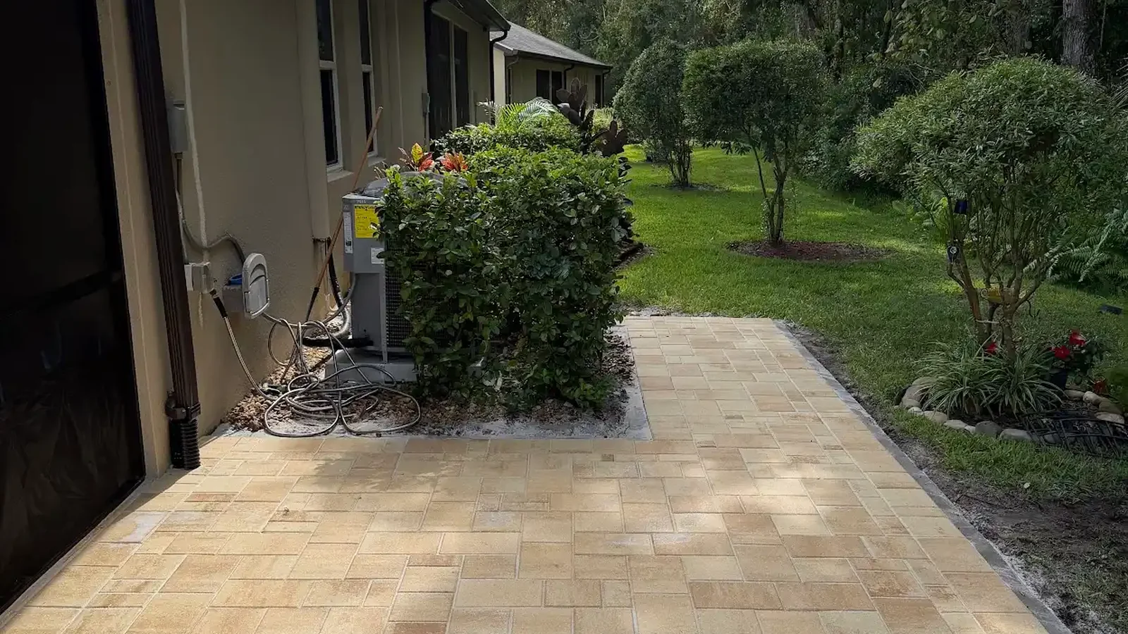
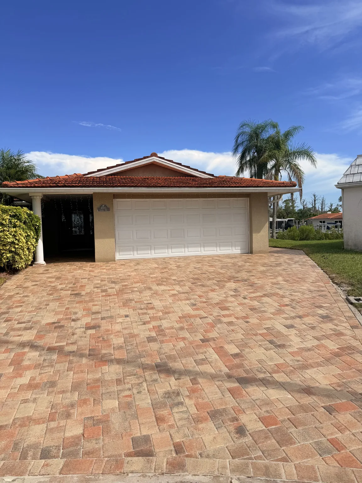
First, identify materials that are unlikely to change soon, such as the roof, brick, stone veneer, window frames, and permanent trim. These elements establish warm, cool, or neutral undertones that the pavers can support. Consequently, a roof with brown and bronze notes may connect naturally with tan, cream, or muted charcoal blends. A cooler gray roof may favor limestone, pewter, or restrained blue-gray tones.
Afterward, Next, treat exterior paint as an important reference without requiring an exact match. The best paver colors usually create a related foundation and enough contrast to keep the hardscape visible. If the pavers repeat the wall color too closely, the property can look flat from the street. In contrast, an extreme difference may divide the house and landscape into disconnected parts.
How to compare the best paver colors on site
Because Florida light changes quickly, place physical samples outdoors and view them in morning sun, midday brightness, late shade, and overcast conditions. Moreover, set the samples on the actual ground plane instead of holding them vertically against a wall. Horizontal light changes the perceived value and texture. A larger sample area gives a more dependable impression than one individual paver.
Then, photograph the samples from the driveway entrance, front door, patio seating area, and interior rooms that overlook the project. The best paver colors should work from several normal viewpoints, not only at close range. However, phone cameras can shift warmth and contrast, so the photographs should support an in-person decision rather than replace it. Notes taken at each time of day make comparisons easier.
Read undertones before naming a color
A label such as beige, gray, or brown covers a wide range of undertones. For example, beige can lean peach, yellow, taupe, or gray, and those differences become clear beside stucco or natural stone. Therefore, compare candidate pavers directly with the house materials. The goal is not perfect sameness but a relationship that looks intentional across changing daylight.
Best paver colors often include a controlled blend rather than one uniform tone. Variation can connect multiple exterior materials and make a broad surface feel less rigid. Nevertheless, highly varied blends need enough installation area for the full mix to appear. On a narrow walkway or small landing, a quieter combination may produce a more coherent result.
Warm, cool, and balanced neutrals
Warm neutrals include sand, buff, cream, tan, and certain brown-gray blends. In many cases, they pair comfortably with terracotta roofs, cream stucco, wood-toned doors, and tropical planting. Meanwhile, cool neutrals include silver, pewter, charcoal, and blue-leaning gray. They can reinforce white, gray, black, and contemporary exterior details when the undertones align.
Balanced neutrals sit between those families and can bridge a mixed palette. For instance, a greige field may connect a cool roof with warmer stone accents. However, surrounding reflections matter because green foliage and painted walls can cast color onto pale paving. Reviewing samples beside the real finishes helps reveal those interactions before installation.
Choose driveway color from the street inward
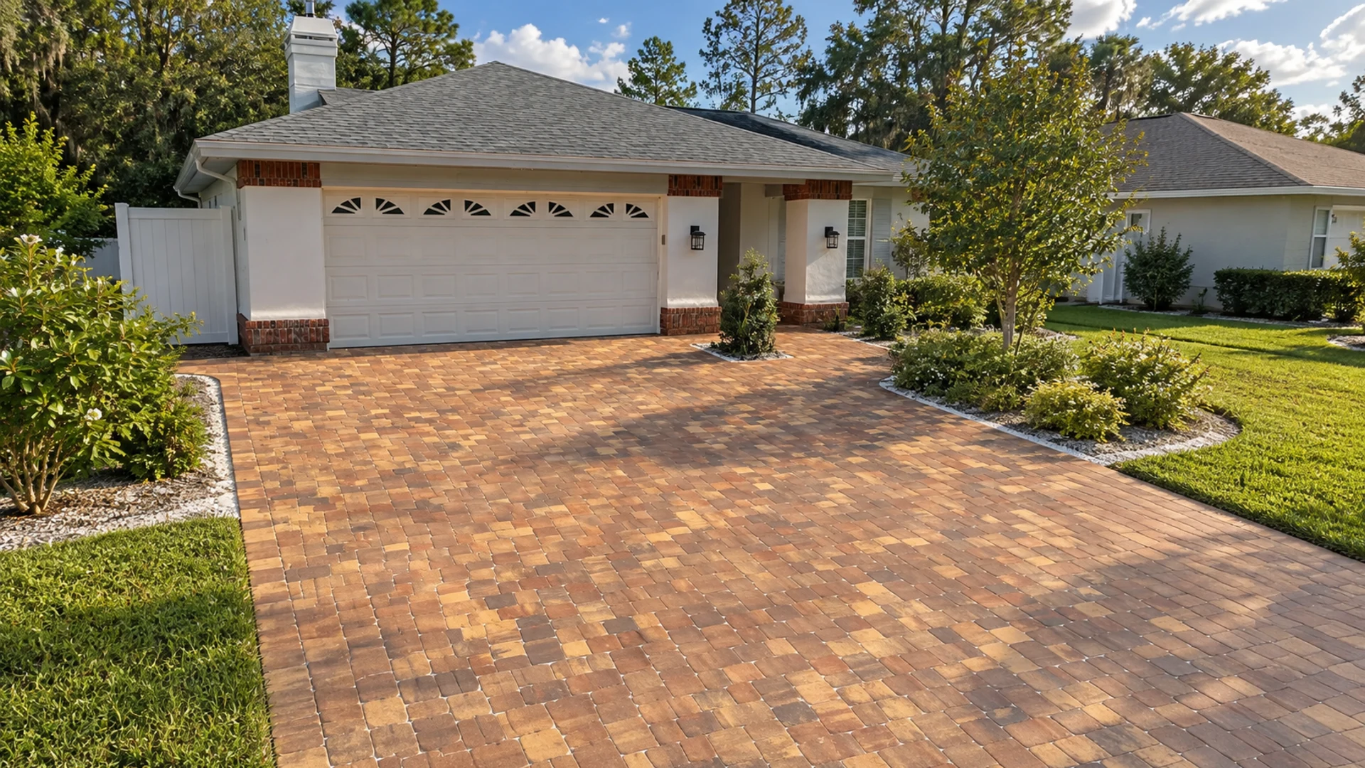
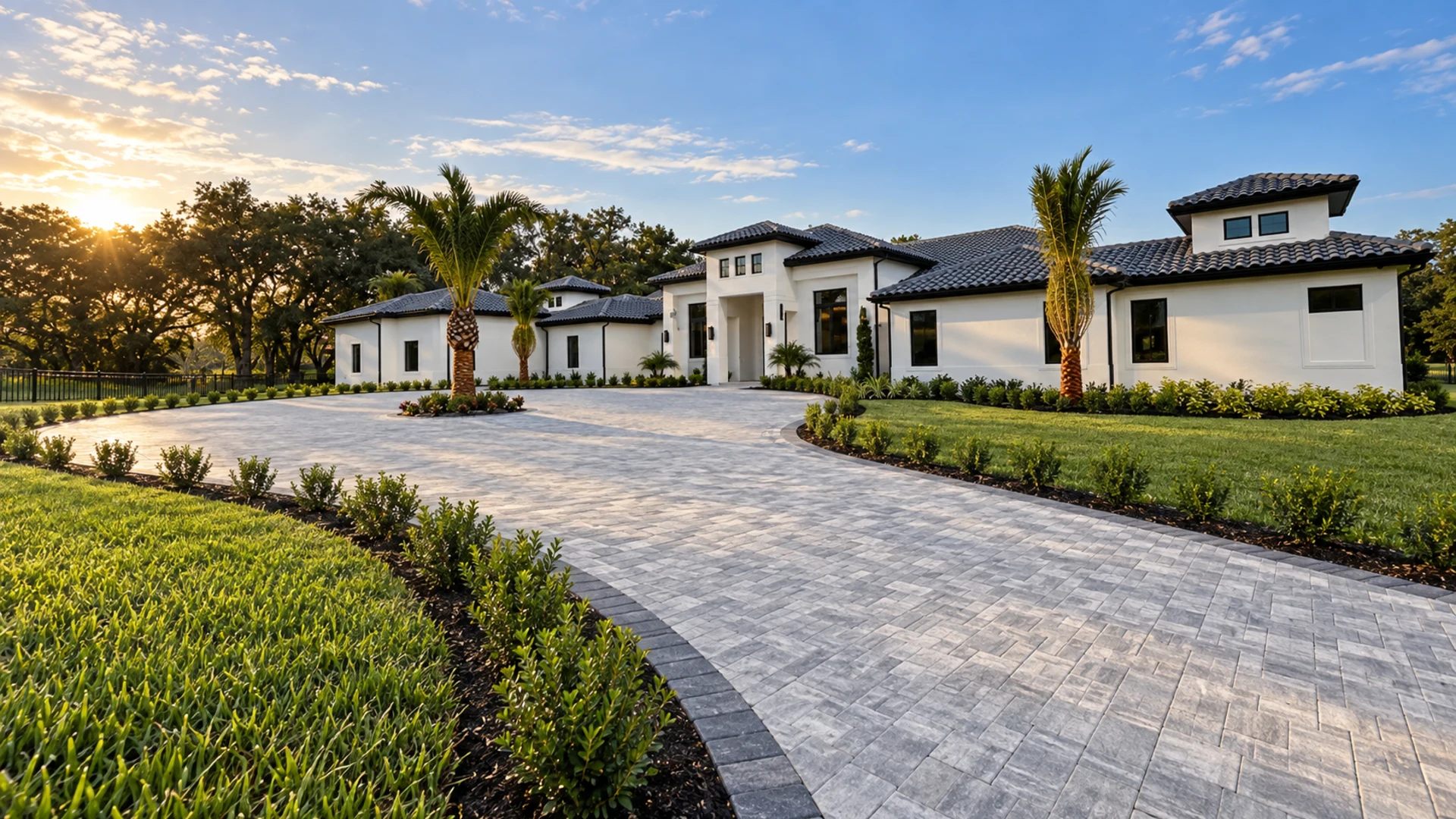
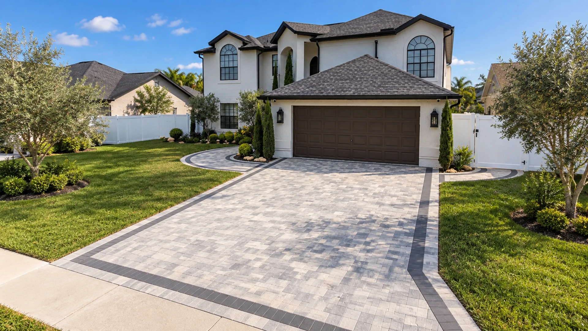
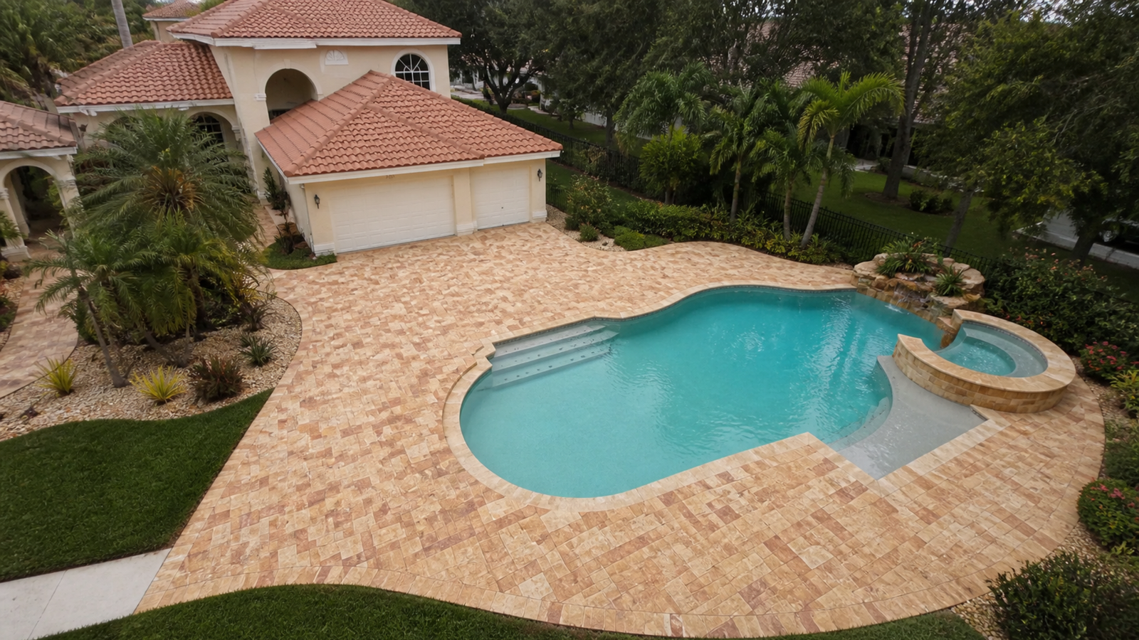
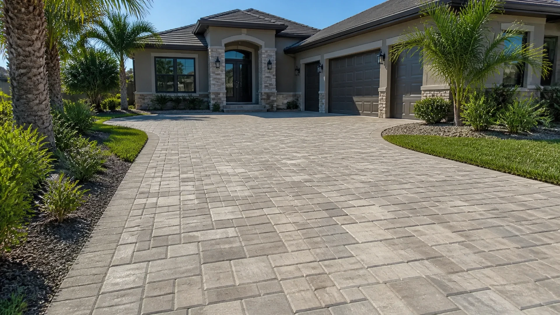
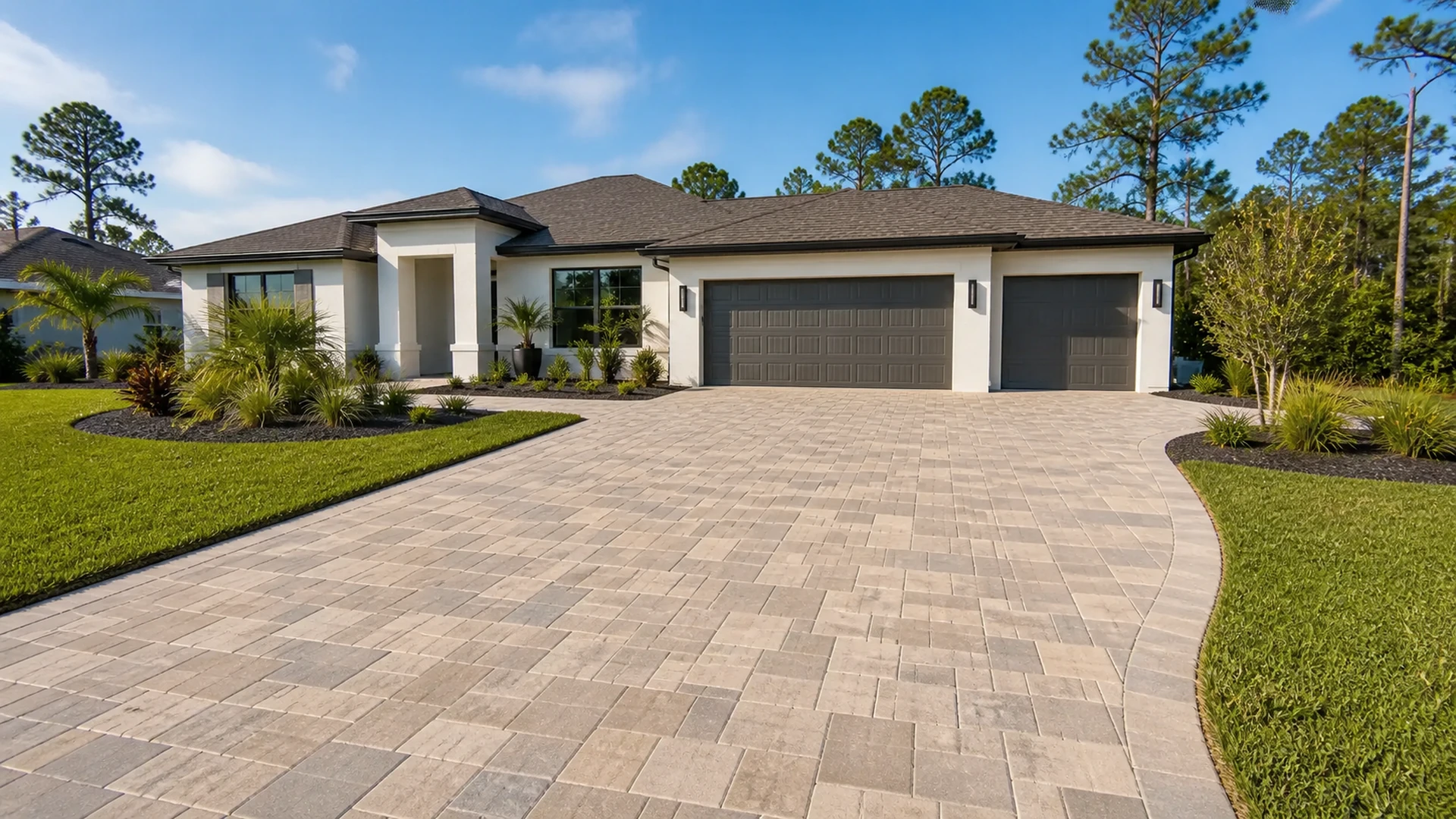
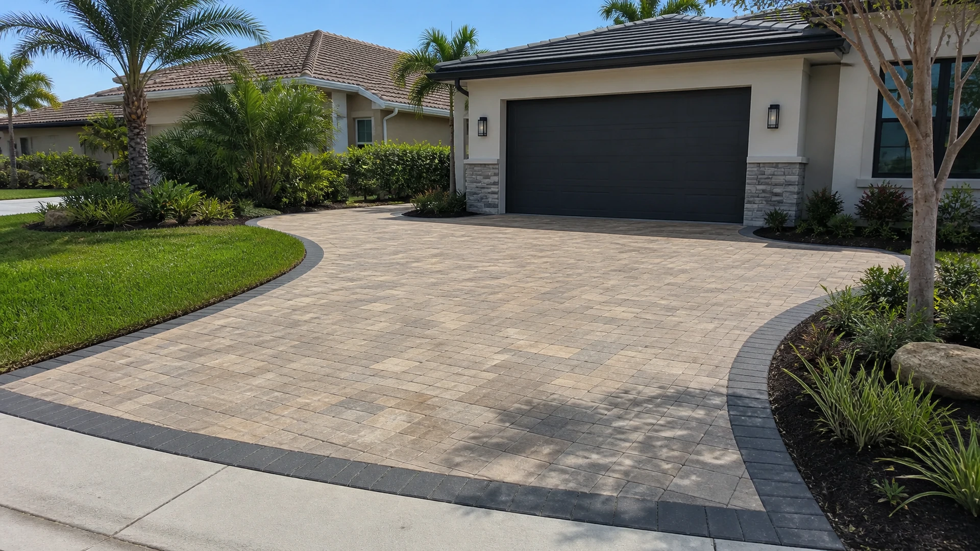
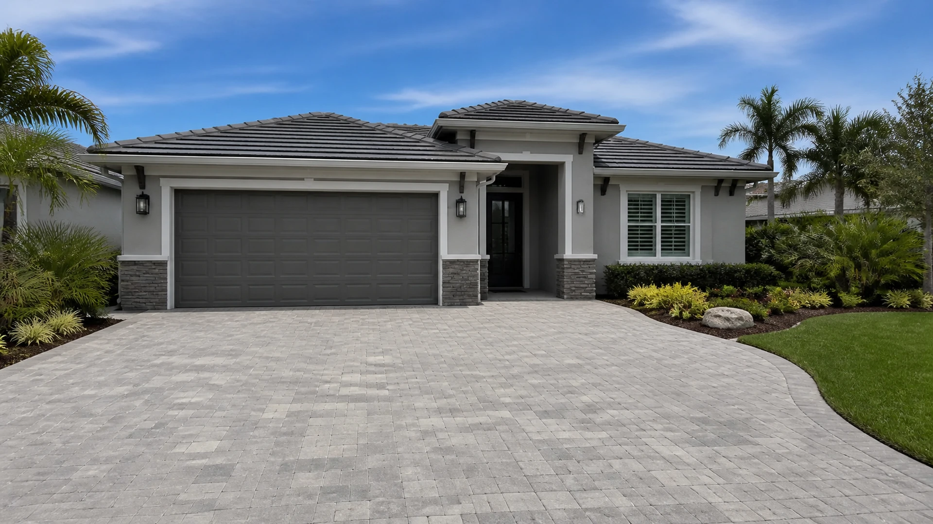
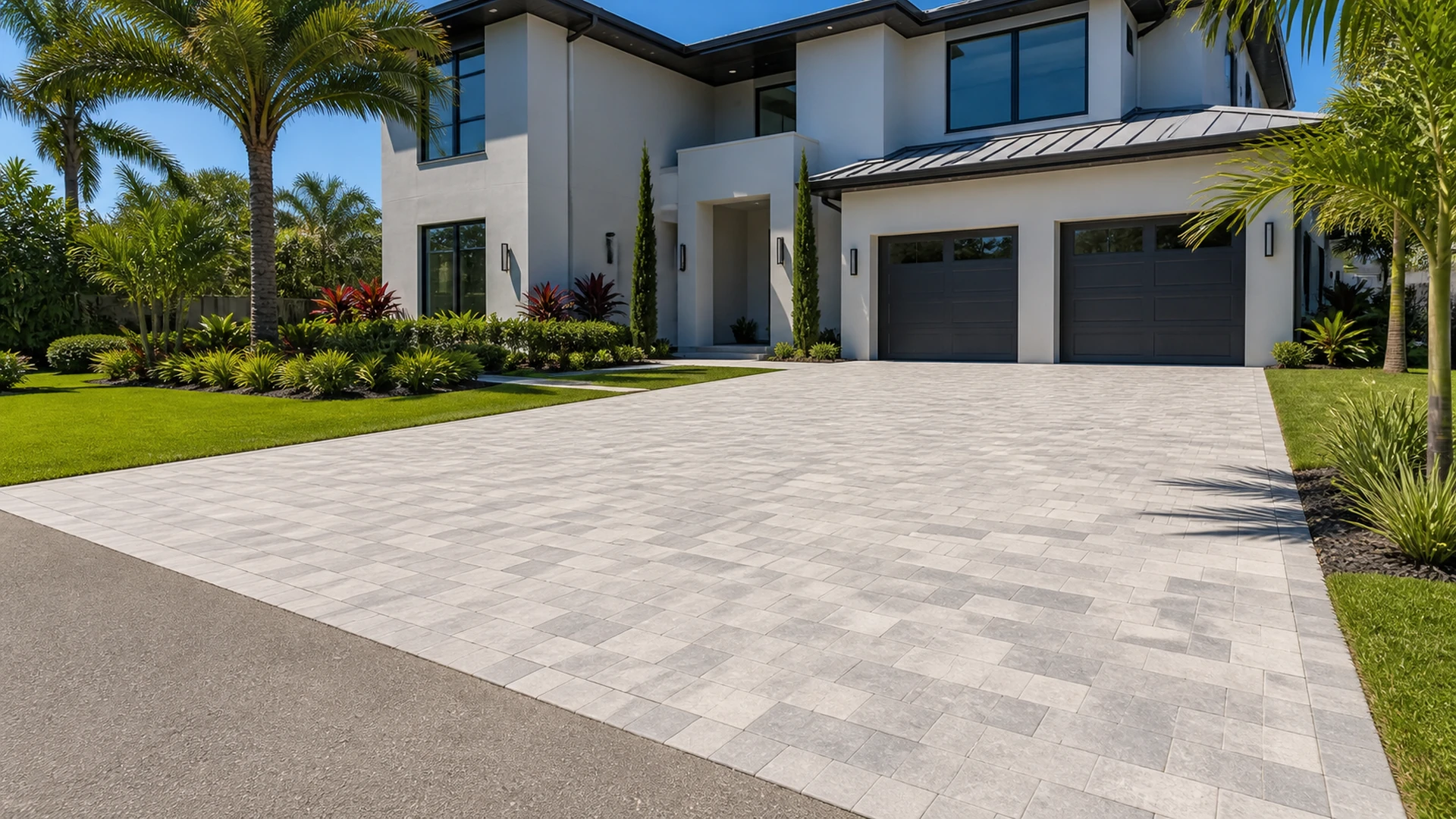
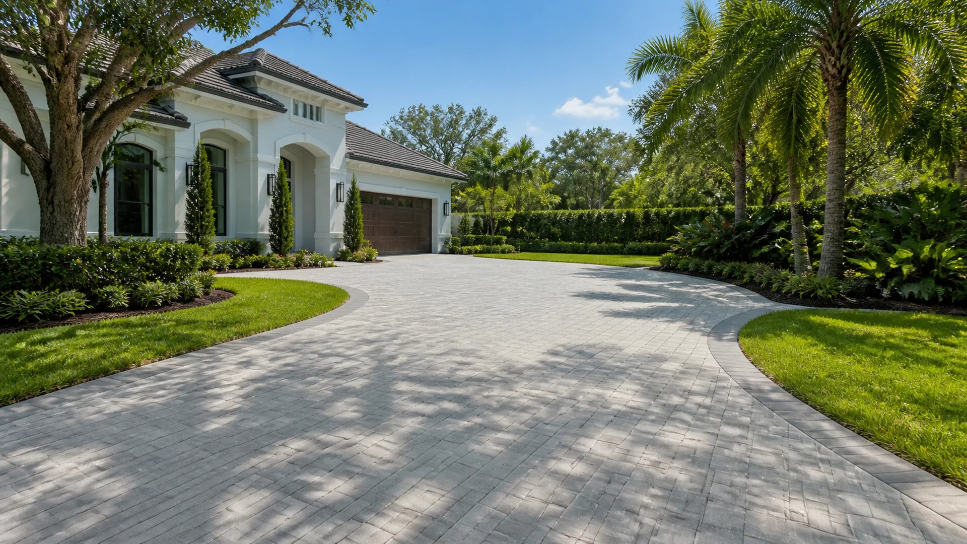
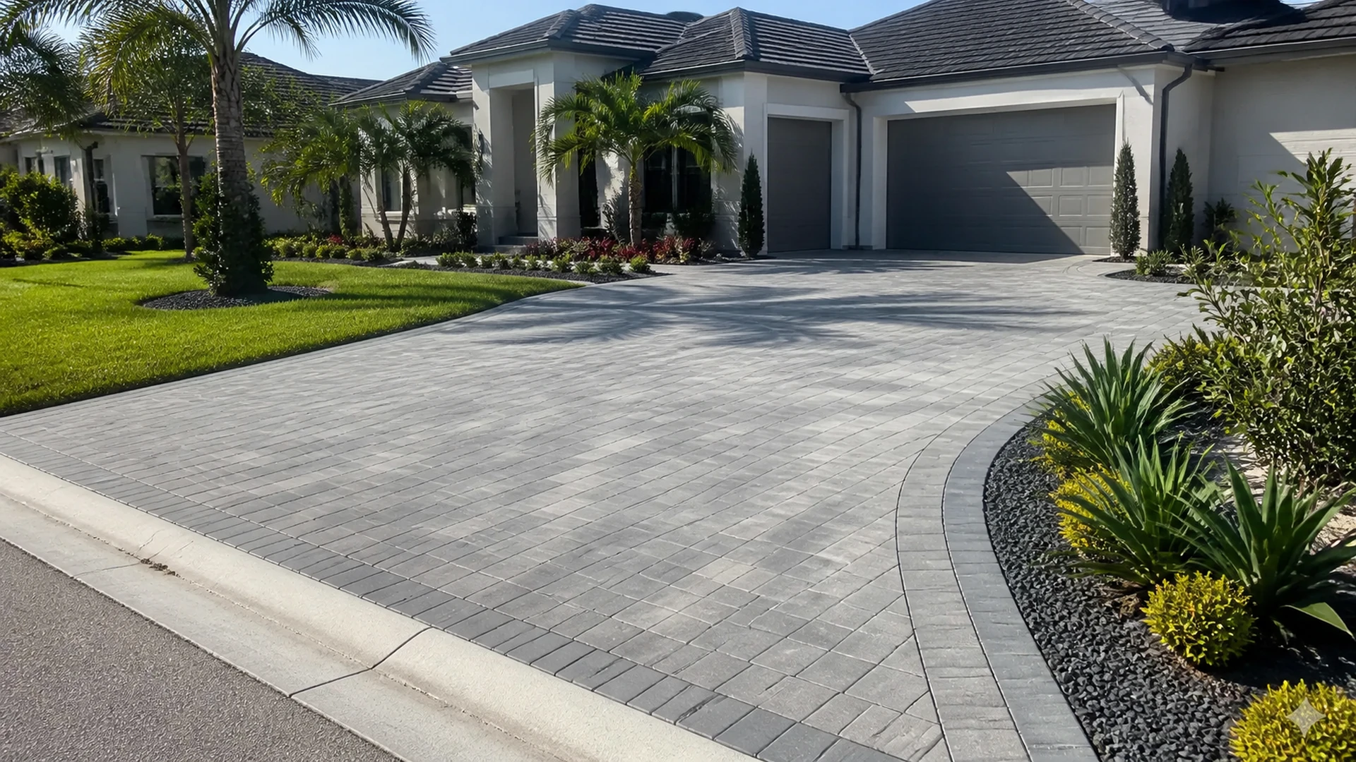
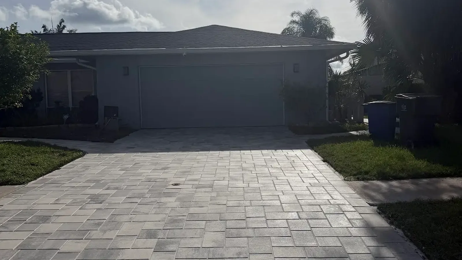
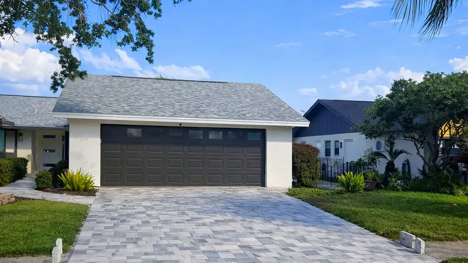
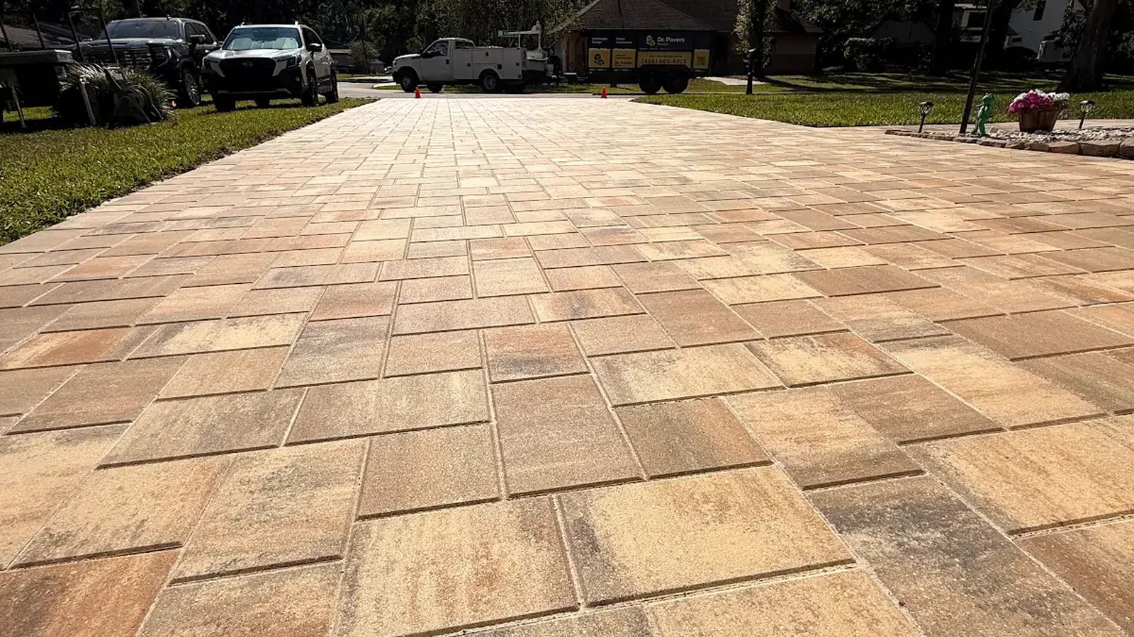
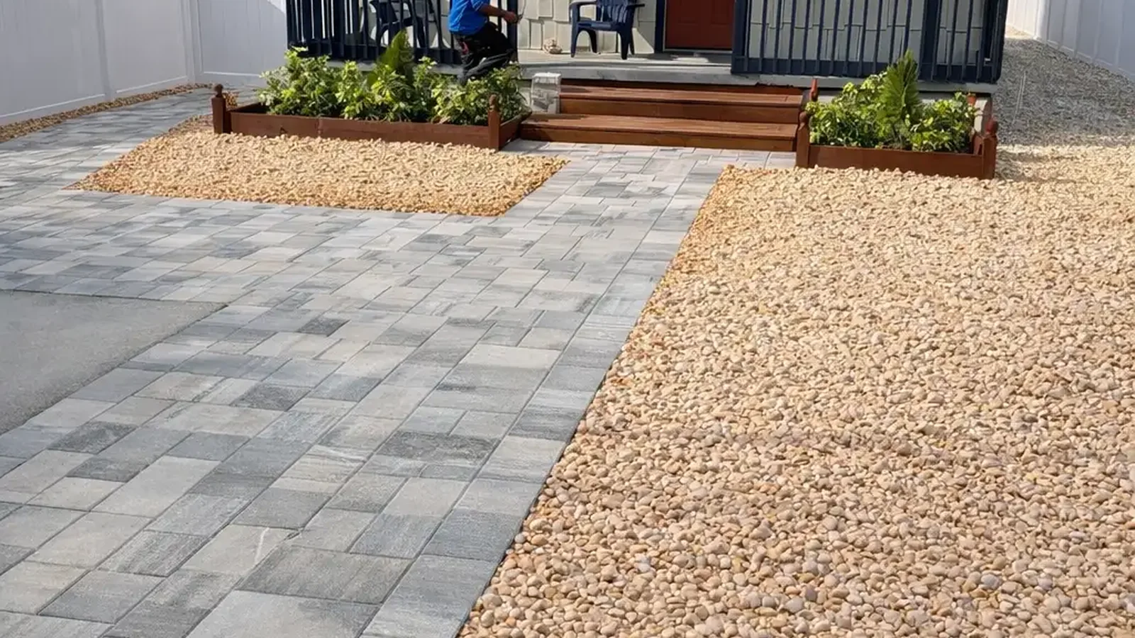
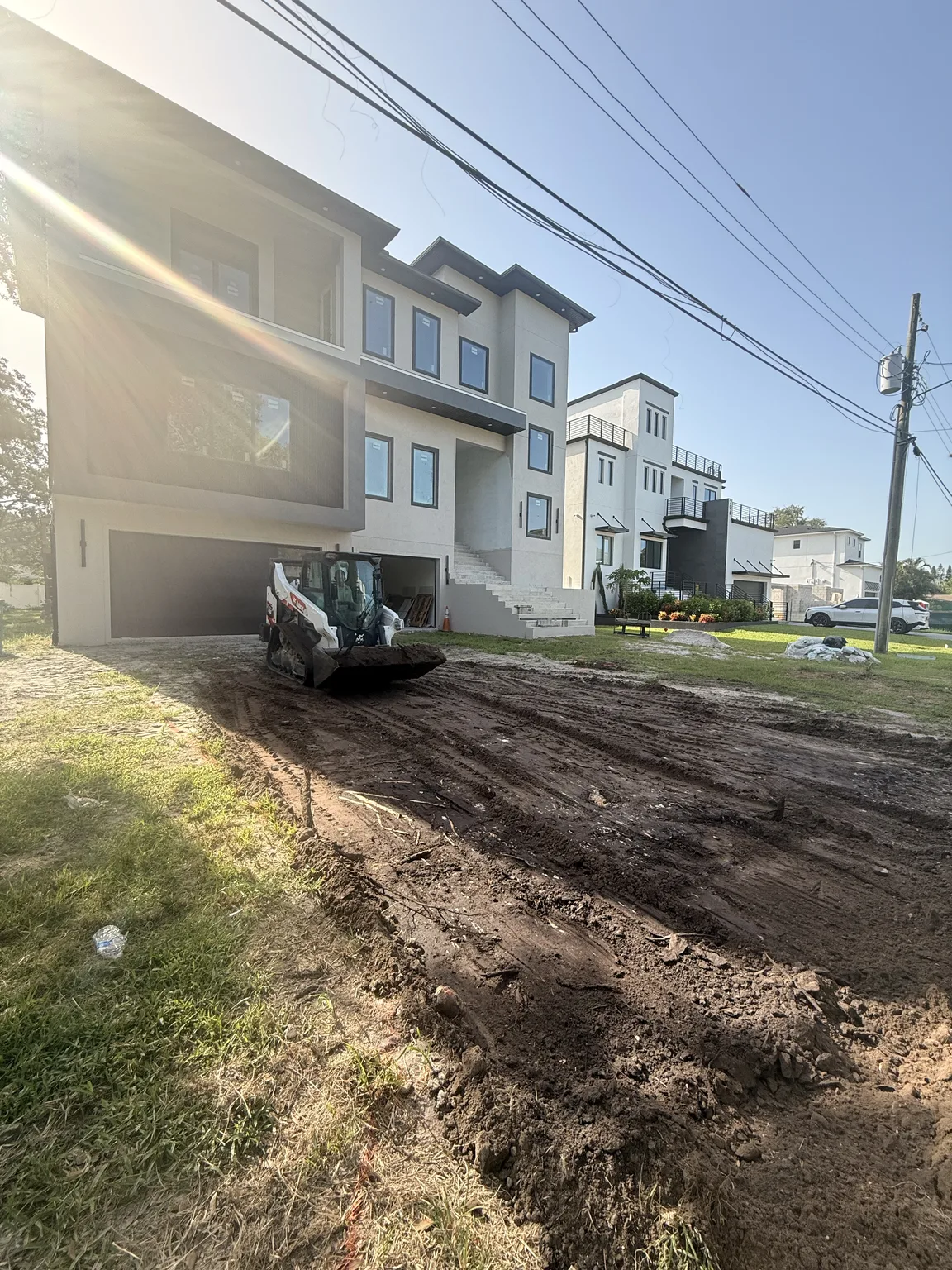
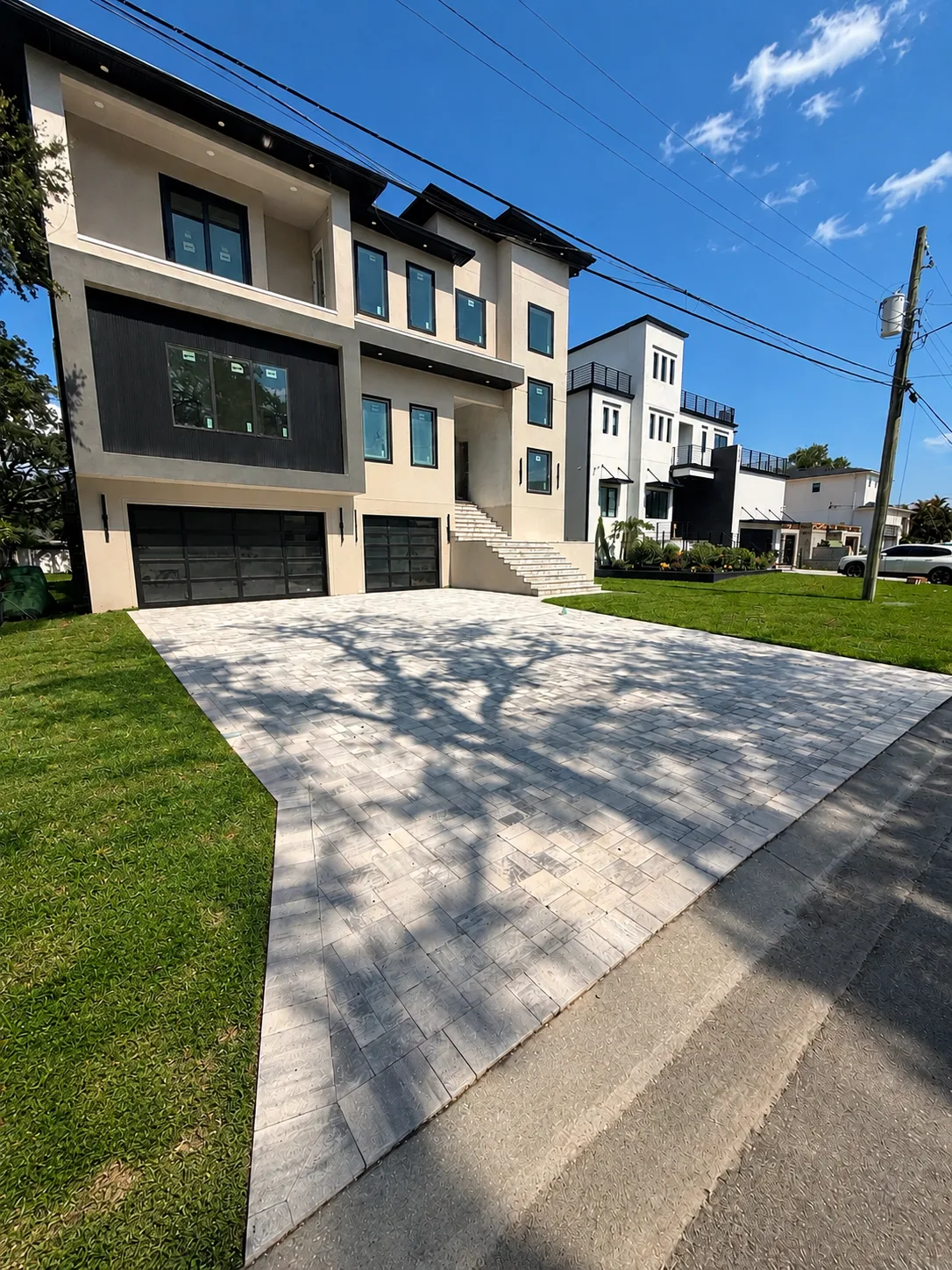
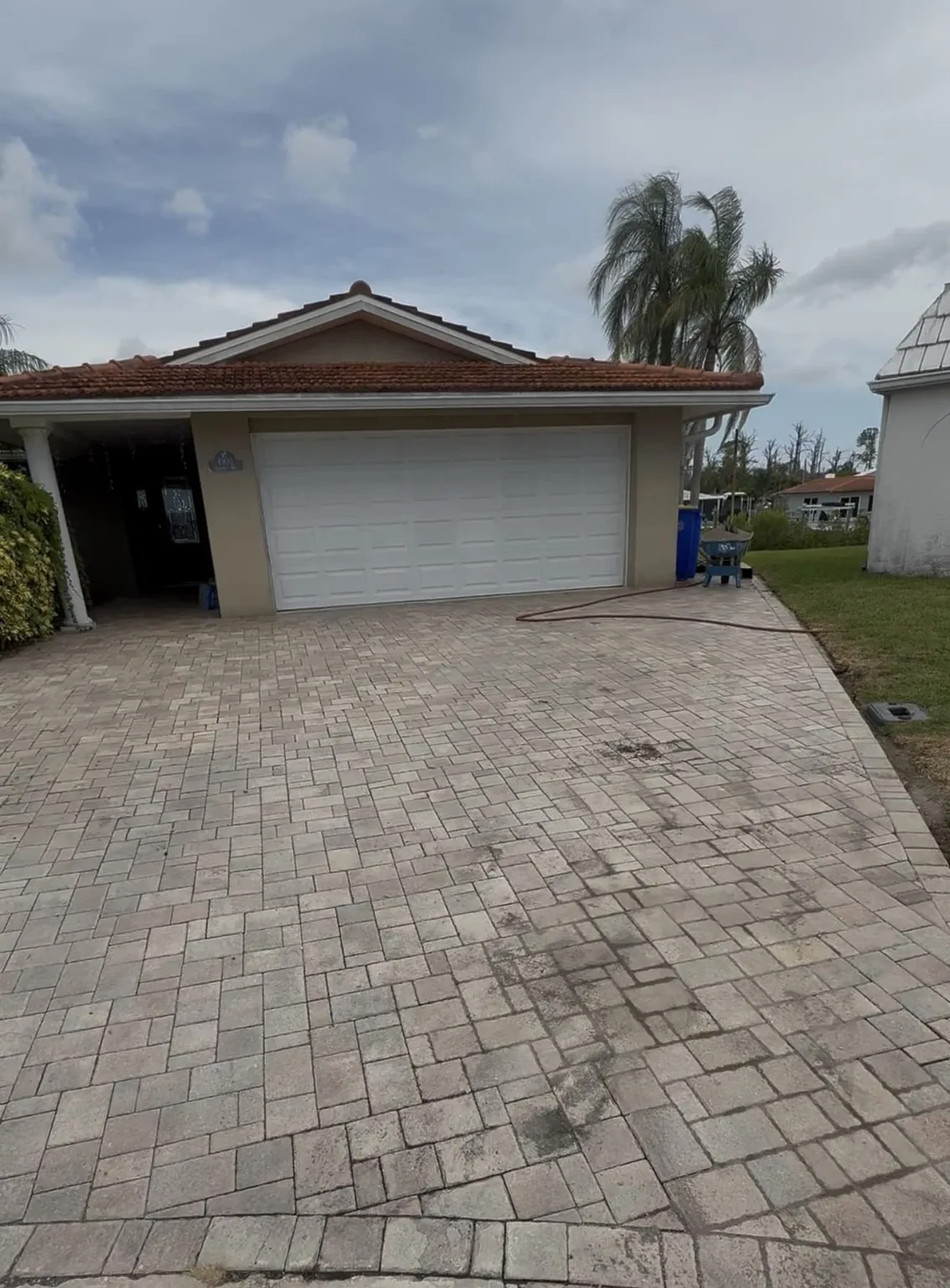
A driveway occupies a large part of the front elevation, so its color influences the entire arrival sequence. Consequently, the best paver colors for this area should relate to the roof and facade while defining a clear path to the garage and entry. Mid-tone blends often balance visual presence with everyday practicality. Very high contrast can emphasize every edge, turn, and width change in the layout.
Instead, Street views also reveal how the driveway fits neighboring lawns, sidewalks, curbs, and homes. Although the palette should belong to your house, it should not be selected as if the property existed alone. A subtle border can frame the field and echo dark window frames or roof notes. Alternatively, a low-contrast border can provide definition without creating a heavy outline.
Account for vehicles and daily use
Since driveways receive tires, soil, leaves, and occasional fluid drips, color variation can make routine marks less visually dominant. However, color does not replace cleaning or correct maintenance. The best paver colors balance the desired facade appearance with realistic use patterns. A sample placed near the garage can show how it relates to the slab, door, and shaded parking area.
When the driveway connects to a front walk, decide whether both areas should share one field color. In some designs, continuity makes the lot feel wider and calmer. In others, a coordinated secondary tone helps the walkway read as a pedestrian route. Therefore, pattern, border, and color should be considered together instead of solving each element separately.
Build pool and patio palettes around experience
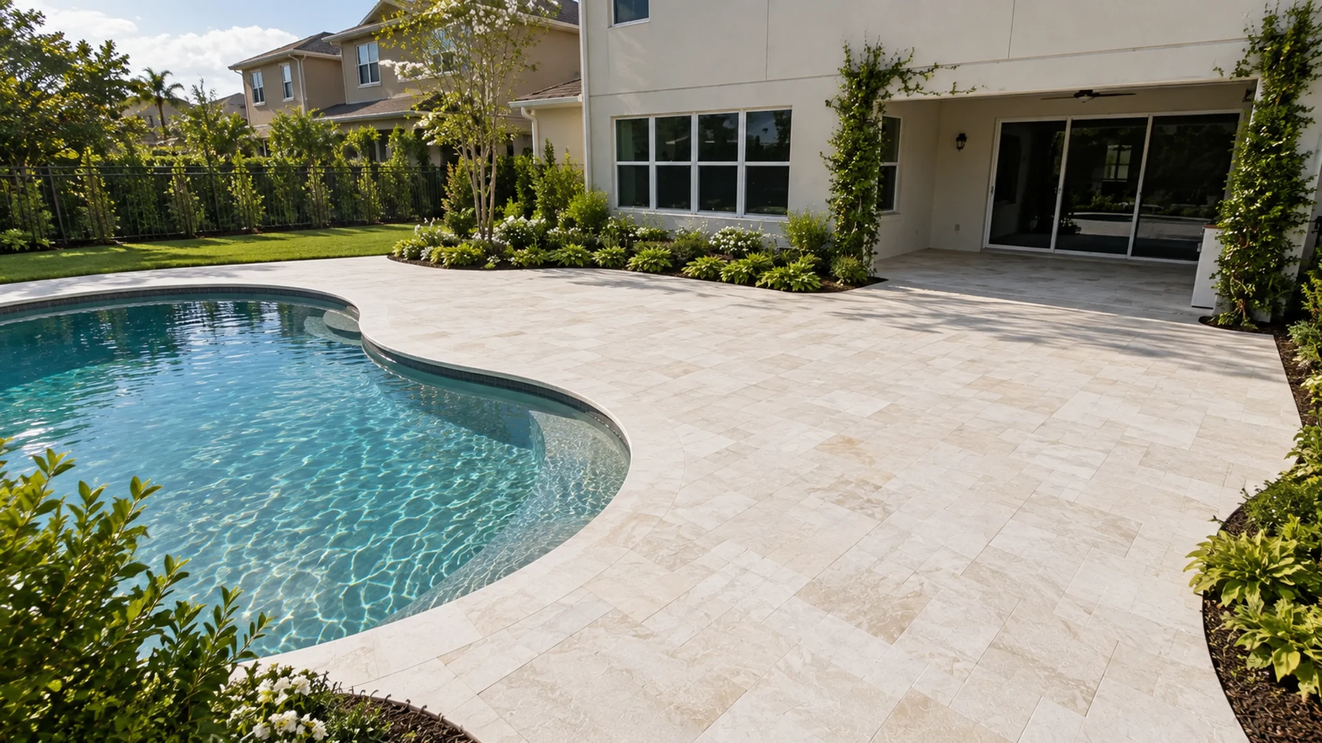
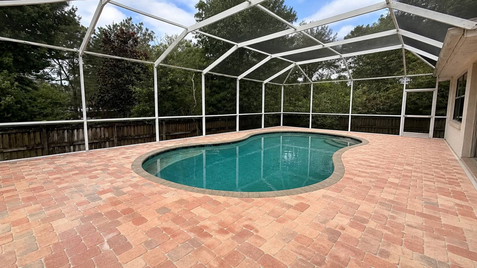
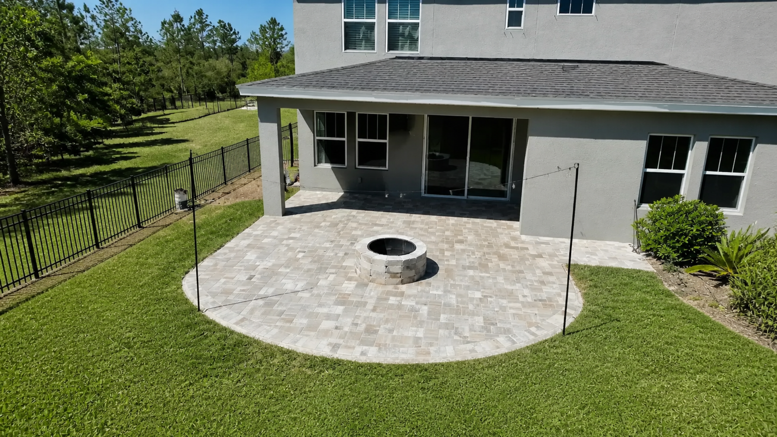
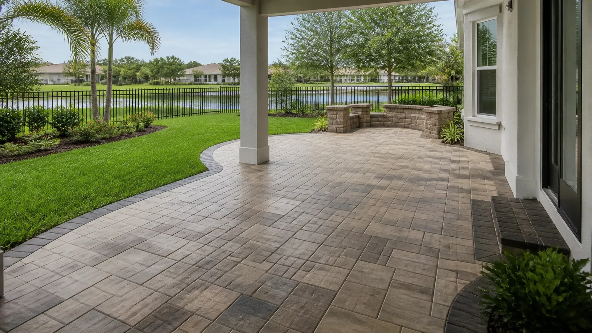
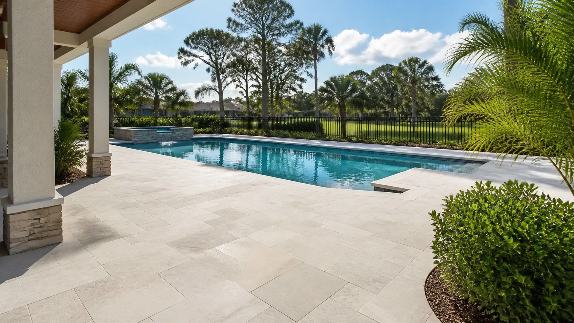
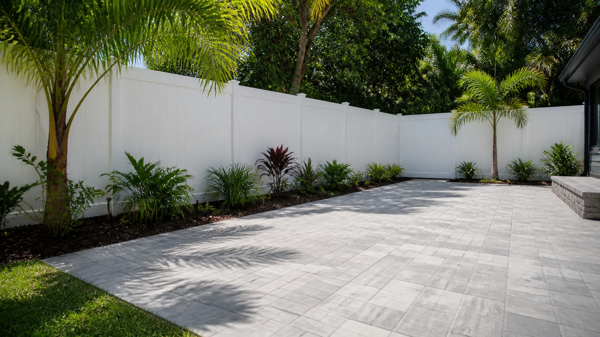
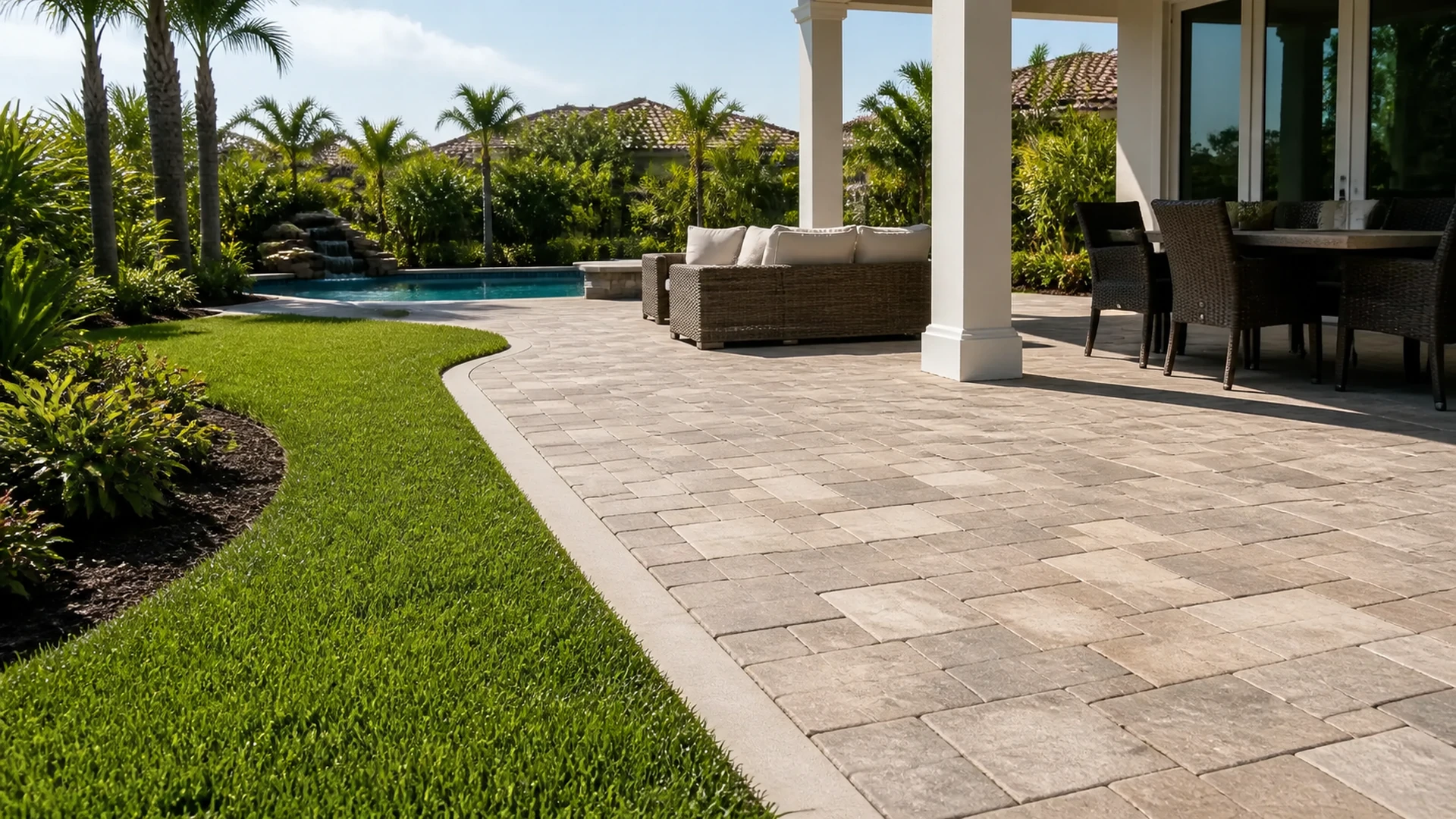
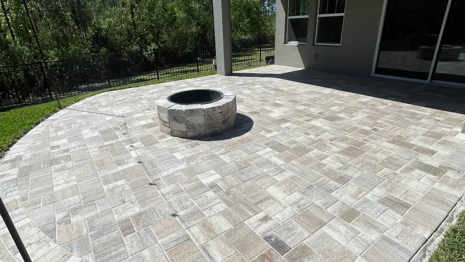
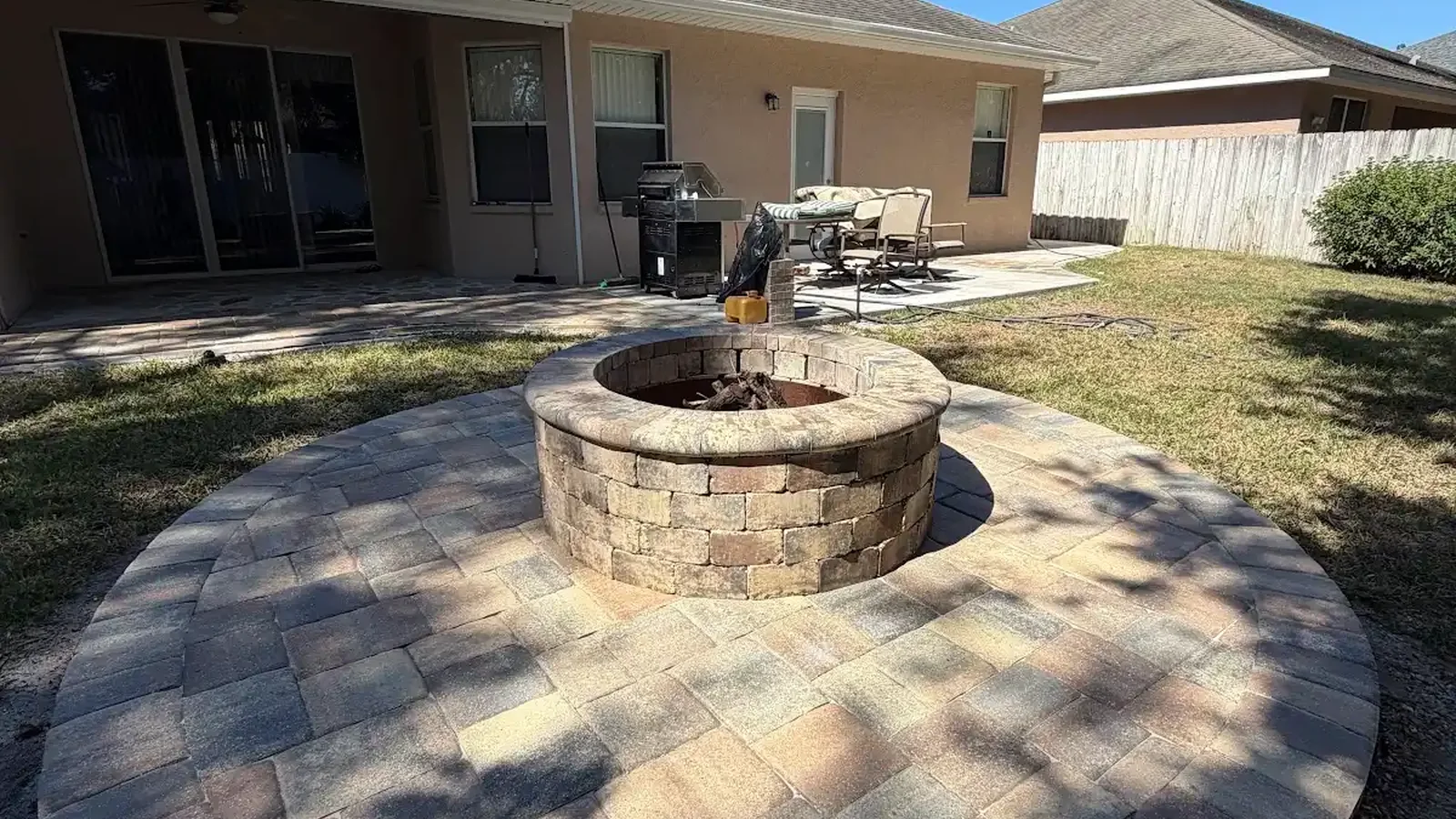
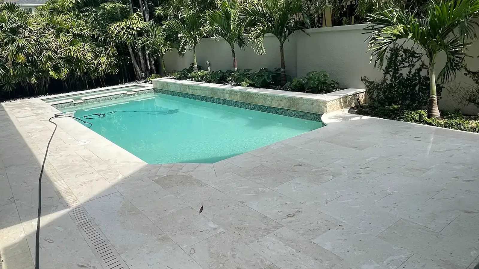
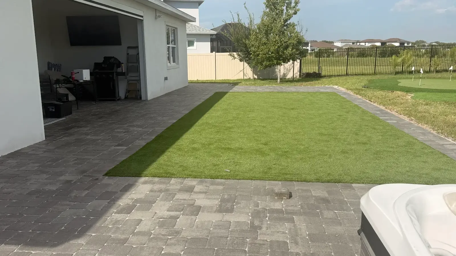
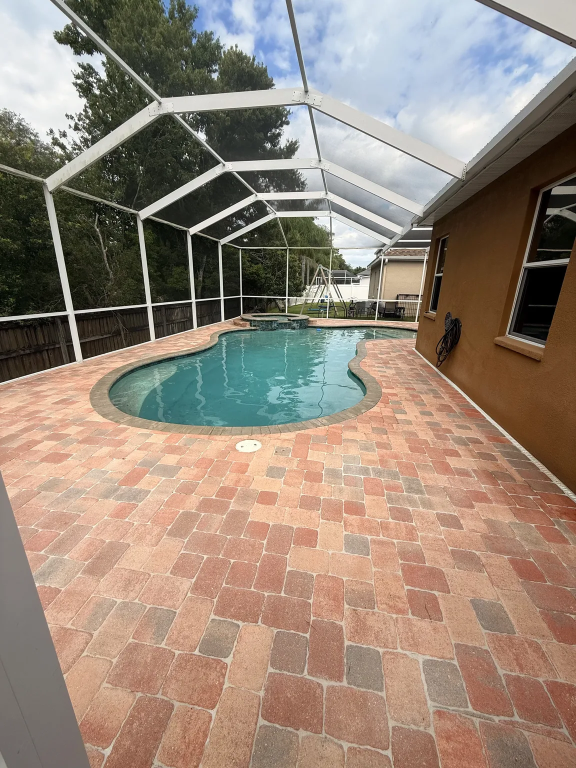
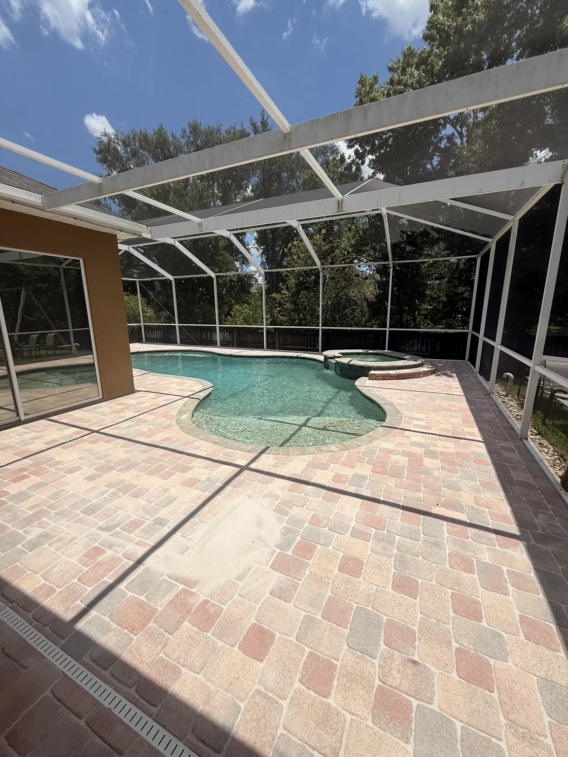
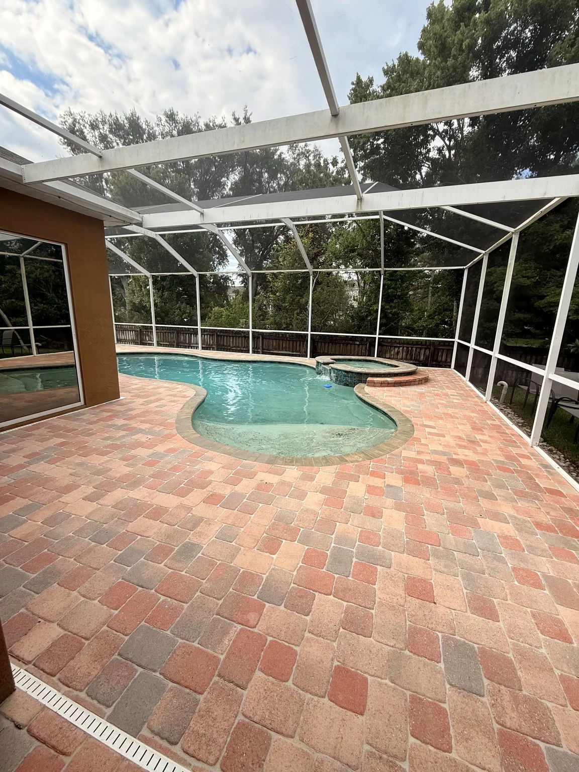
Nevertheless, Behind the house, the viewing distance becomes shorter and people spend more time directly on the surface. As a result, texture, glare, surrounding reflections, and transitions to indoor flooring become more noticeable. Best paver colors for a patio may draw from lanai columns, outdoor furniture, pool tile, or garden materials. The palette can feel connected to the front without being identical.
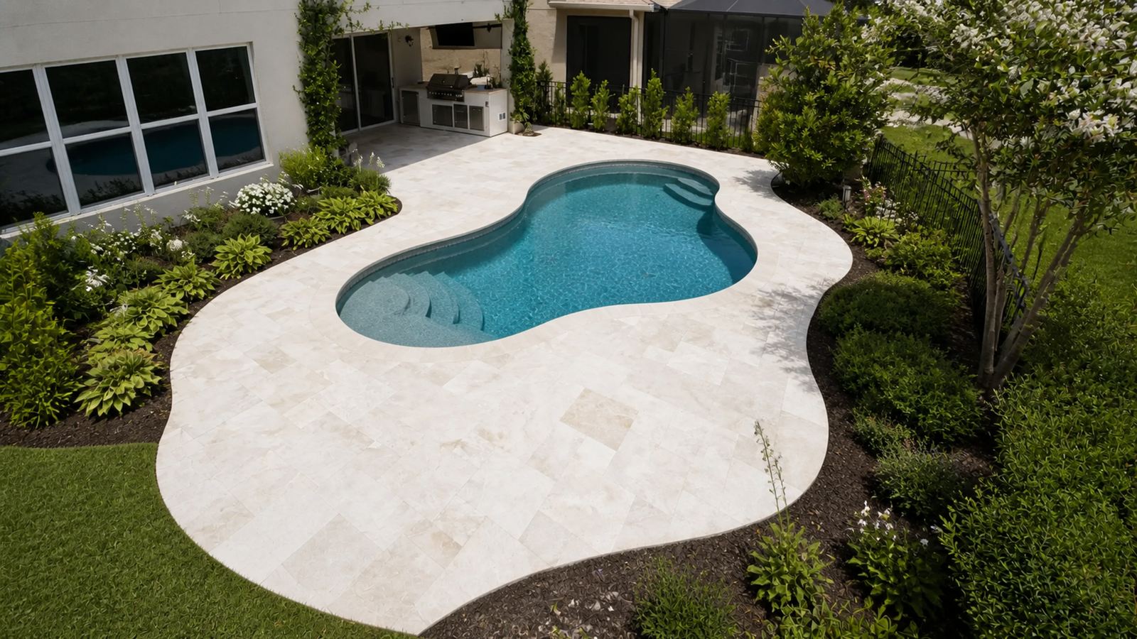
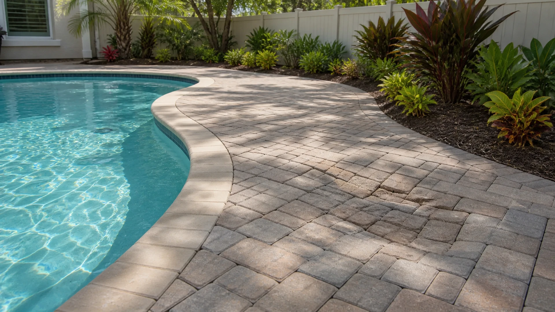
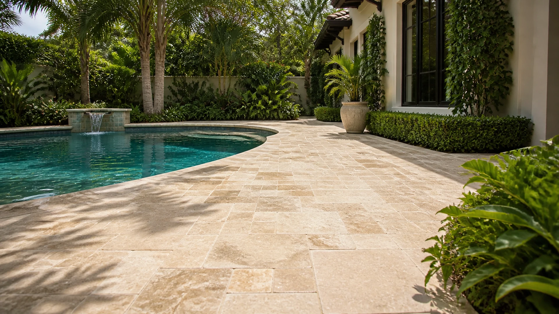
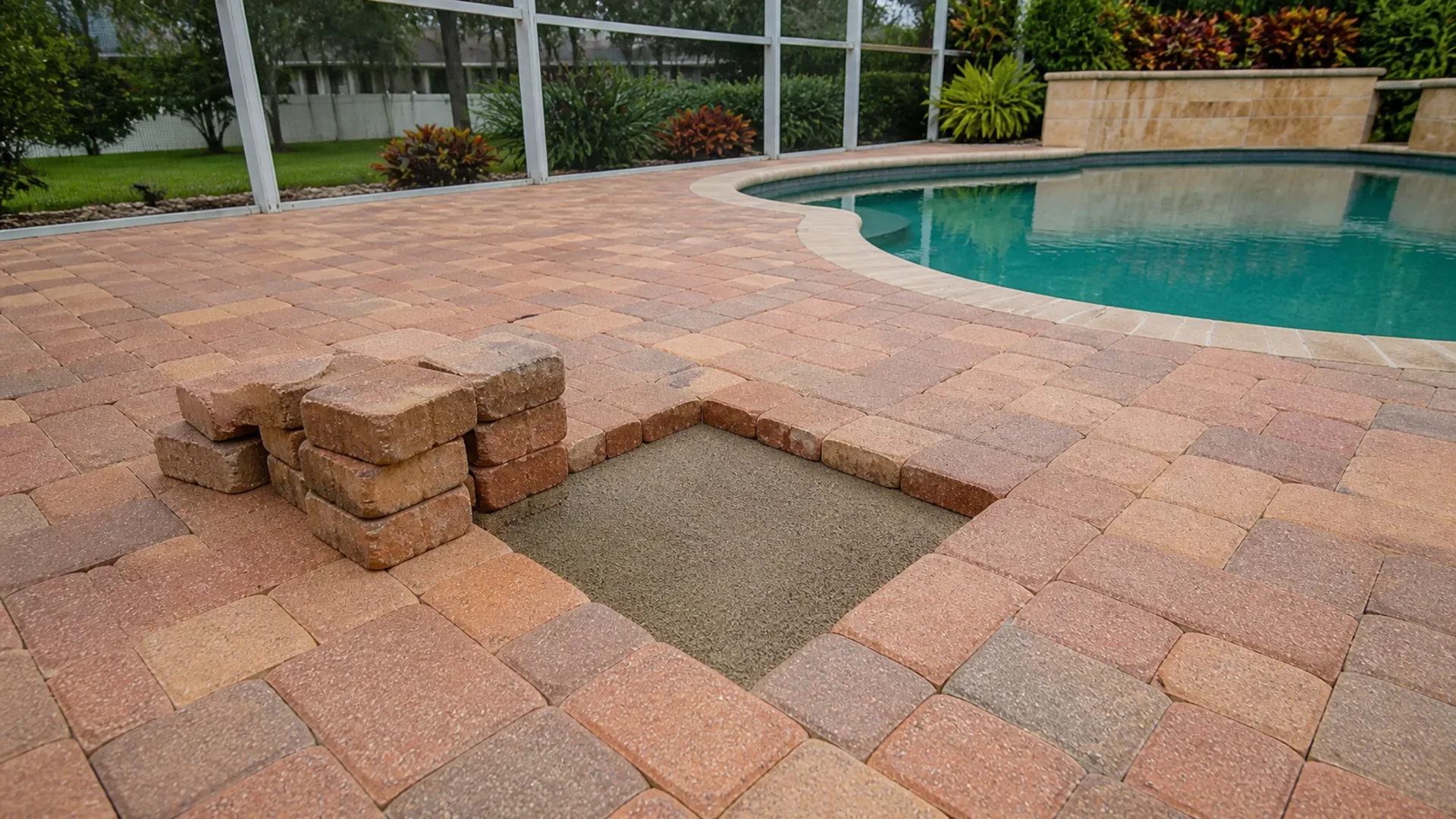
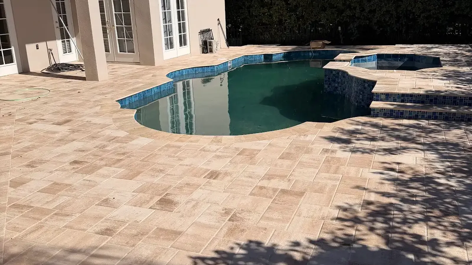
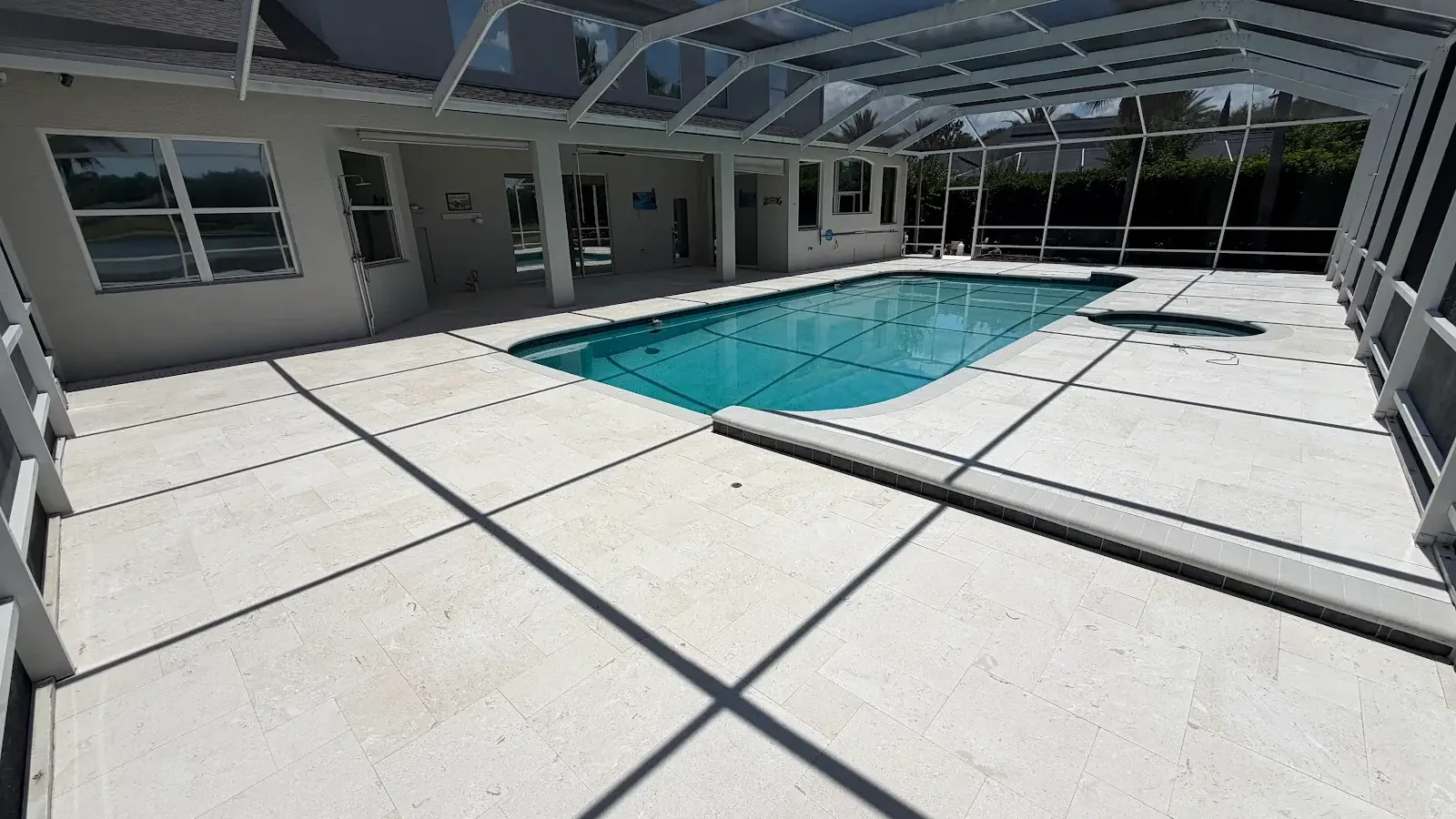
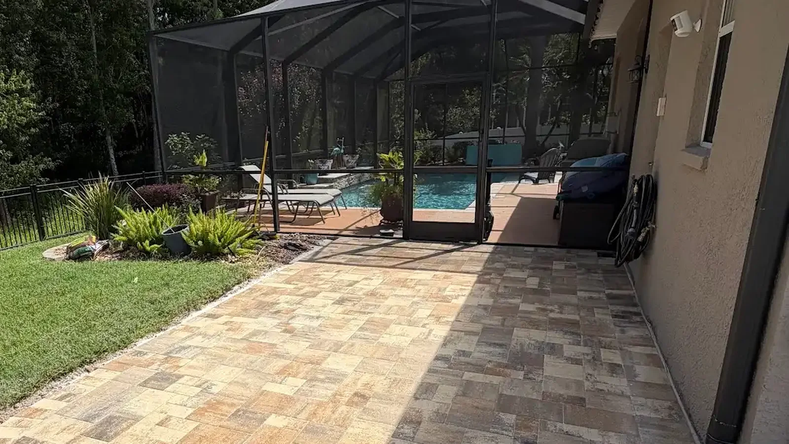
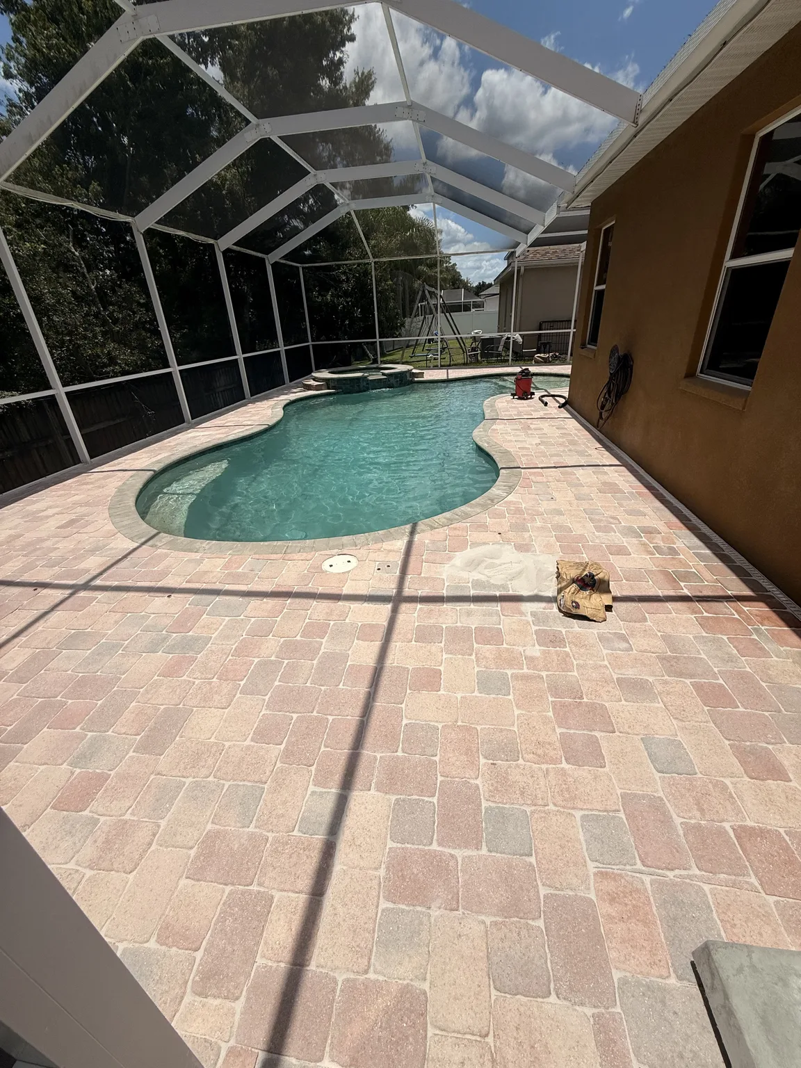
Near a pool, water changes how colors are perceived. For example, blue tile and reflected sky can cool nearby gray or cream tones, while wet surfaces appear deeper and more saturated. Therefore, dry and damp samples provide useful comparisons. Color choice should accompany a broader review of surface characteristics, layout, edge details, and maintenance needs for the specific pool area.
Coordinate with indoor floors and covered lanais
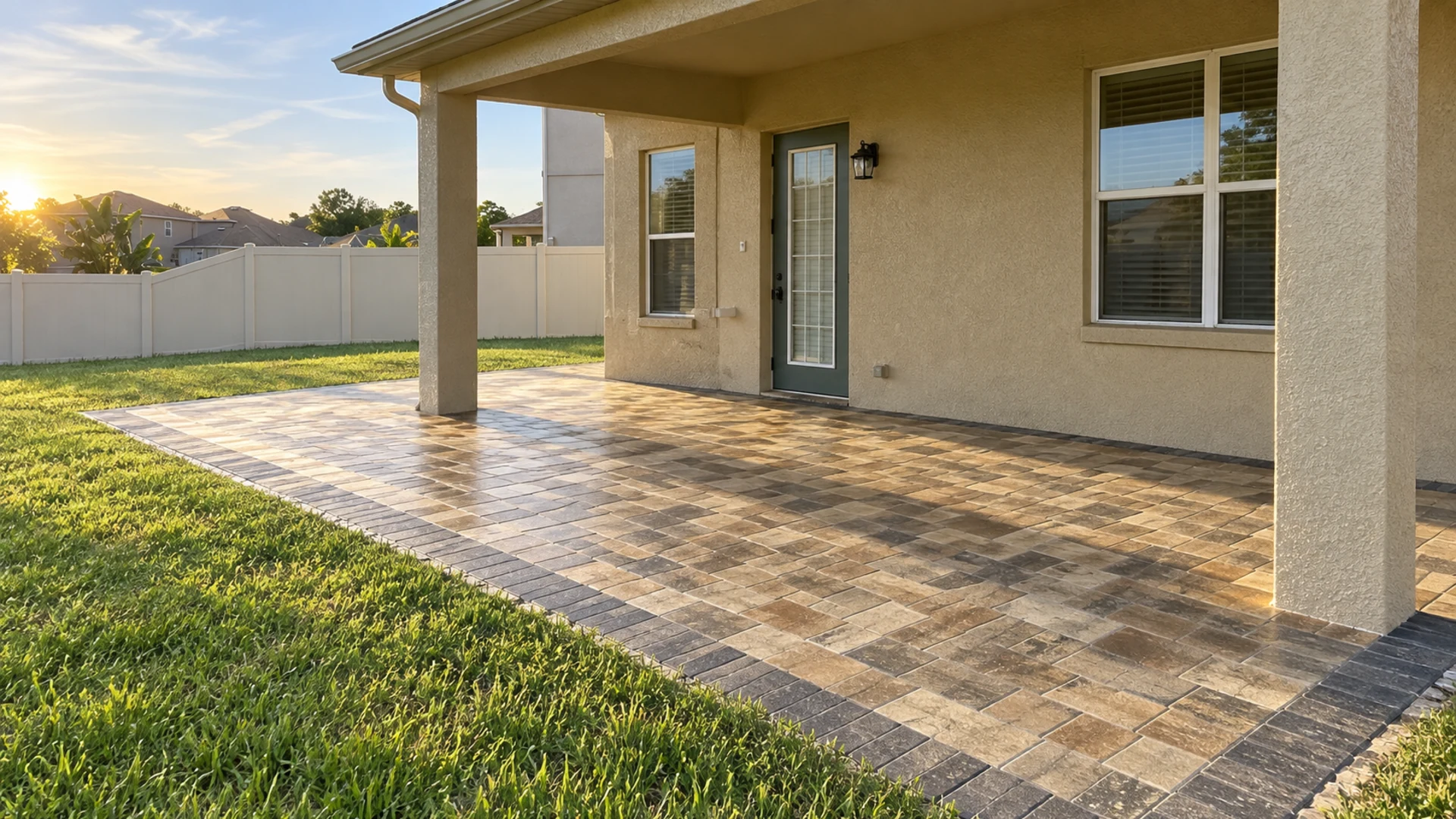
Furthermore, Large glass doors can make interior and exterior floors appear in one continuous view. Accordingly, compare the paver with tile, wood, or stone visible just inside the home. An exact color match is rarely necessary, and different materials naturally reflect light in different ways. A shared undertone or related value often creates a smoother visual transition.
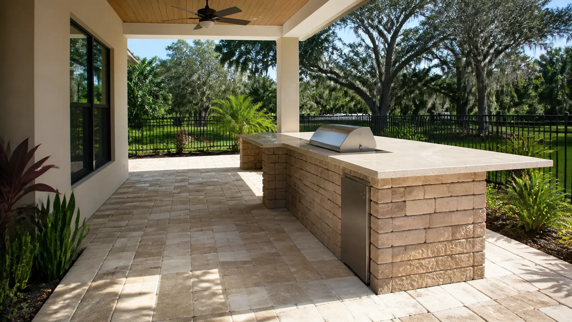
Covered lanais add another lighting condition because the same paver can look darker beneath the roof than in the open yard. Best paver colors should remain readable across that boundary without producing an accidental stripe. Consequently, place several samples from shade into sun. This simple arrangement exposes value shifts that a catalog image cannot show.
Use borders and accents with restraint
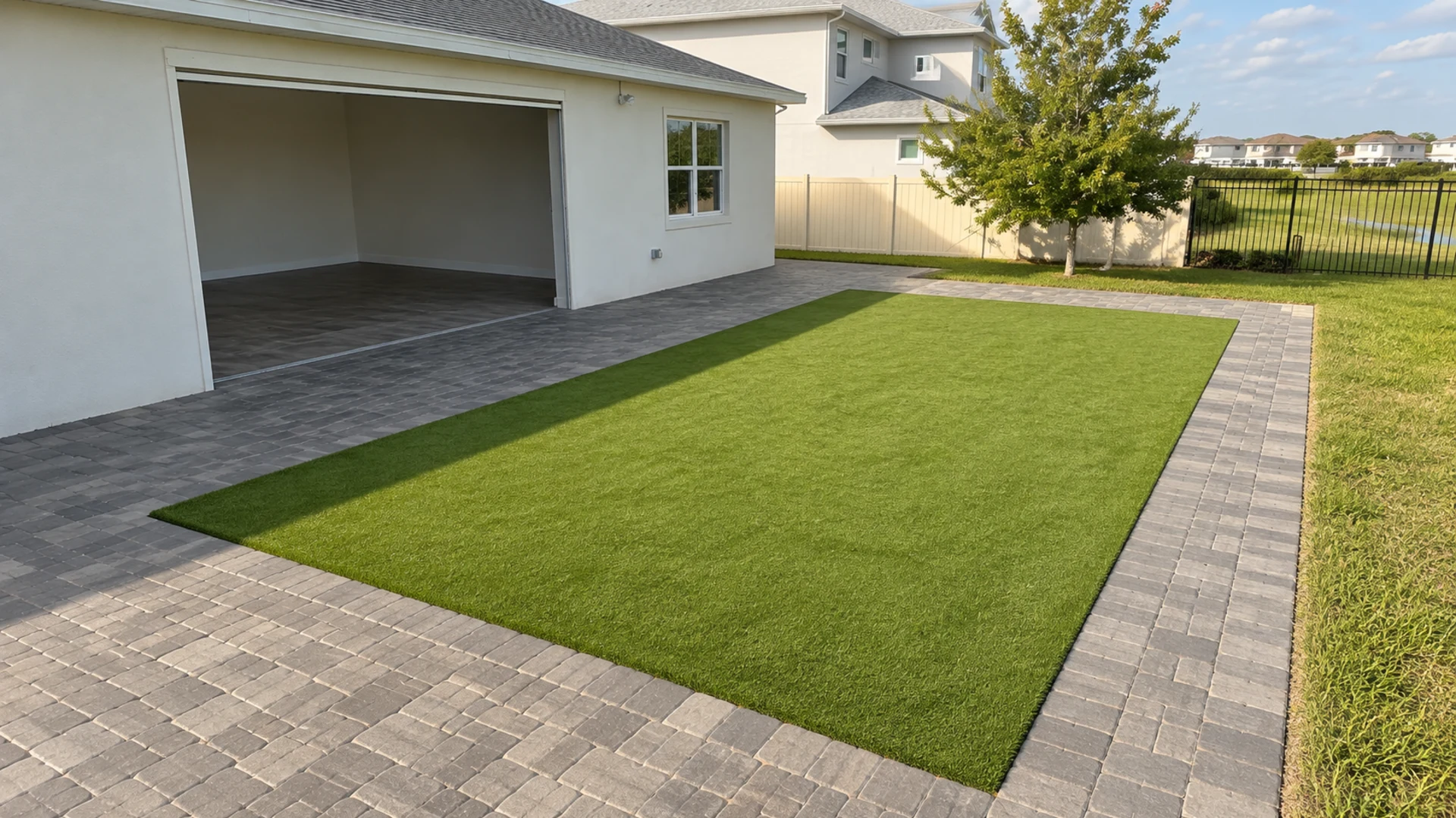
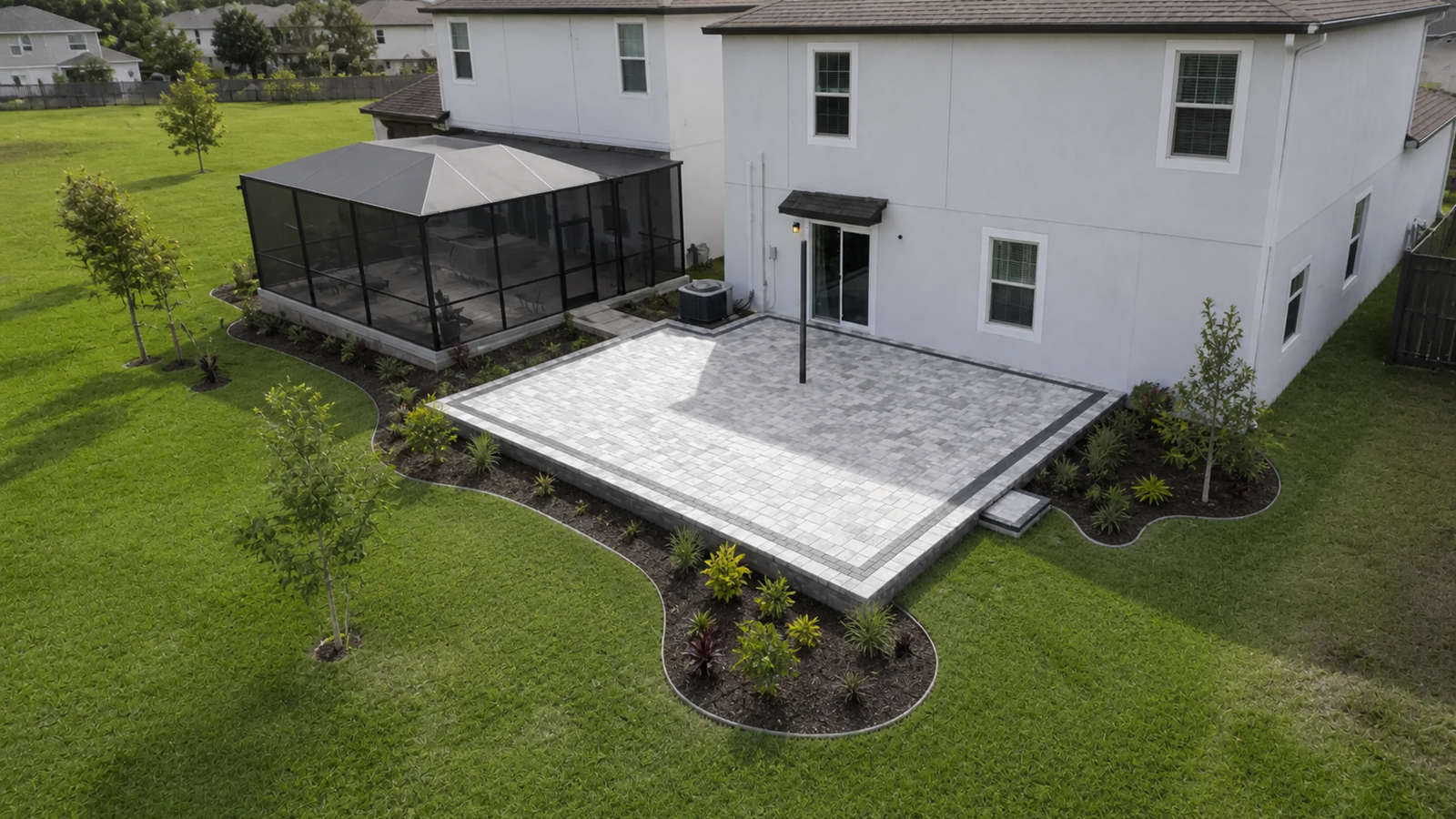
Borders can define curves, separate zones, or connect hardscape details to the house. Nevertheless, a border becomes visually stronger as contrast increases. Dark charcoal around a pale field creates a crisp frame, while a neighboring mid-tone gives gentler definition. The choice should reinforce the geometry that homeowners want people to notice.
Multiple accent colors can compete with patterned pavers, decorative pool tile, and active landscaping. Therefore, the best paver colors often come from a disciplined palette with one main blend and one supporting accent. Repeating the accent at selected edges can create rhythm. Using it around every shape, by comparison, may divide a compact yard into too many pieces.
Let pattern carry some of the design work
Meanwhile, Color is only one source of visual interest because paver size and laying pattern also affect movement. For instance, a varied modular pattern can add detail even within a quiet neutral blend. A simpler running pattern may allow a stronger color variation to take the lead. Accordingly, samples should represent both the proposed color mix and the intended format whenever possible.
Consequently, Joint color contributes another fine line across the field. Although joints are narrow, their contrast can make the pattern more or less prominent. Weather and maintenance will also change their appearance over time. For that reason, evaluate the complete assembly rather than judging the paver face as a standalone finish.
Connect color with Florida landscaping
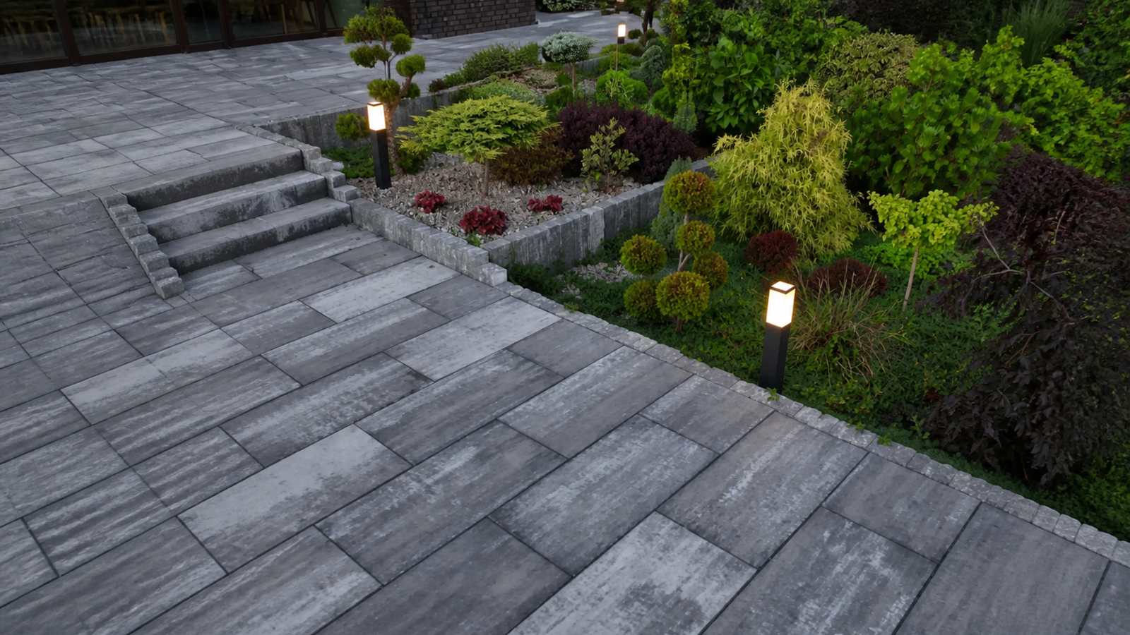
Tampa Bay planting often combines deep greens, palms, flowering shrubs, ornamental grasses, mulch, and stone. Against that background, pale pavers can create a clean contrast, while earthier blends can merge softly with beds and trunks. Best paver colors should support the intended mood of the garden. However, nearby soil and leaf litter may also affect how tidy each option appears between cleanings.
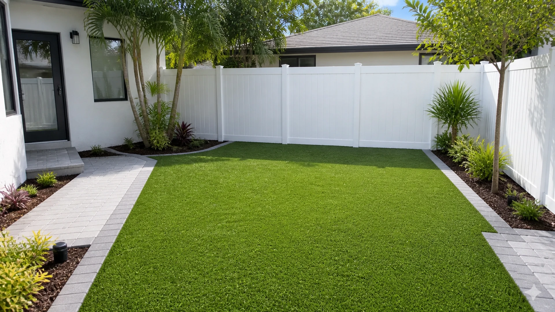
Hardscape color can also guide the eye toward focal plants, water, seating, or an outdoor kitchen. A restrained field provides a calm foreground when the landscape already contains many colors. Conversely, a simple green lawn and neutral facade may accommodate more variation in the paving. Therefore, homeowners should assess the full composition at mature planting size, not only the current bed.
Consider mulch, gravel, and retaining features
Similarly, Landscape materials touch the pavers directly, making undertone conflicts easy to notice. For example, red-brown mulch can intensify warmth beside a cream field, while white stone can make the same field appear darker. Accordingly, bring a small amount of the adjacent material beside the samples. This quick comparison helps the best paver colors relate to the details already present.
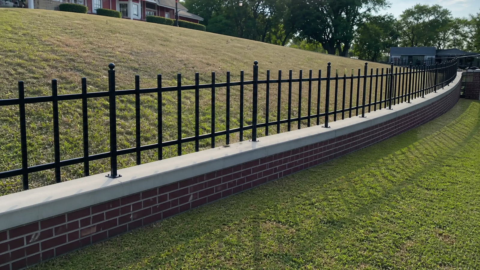
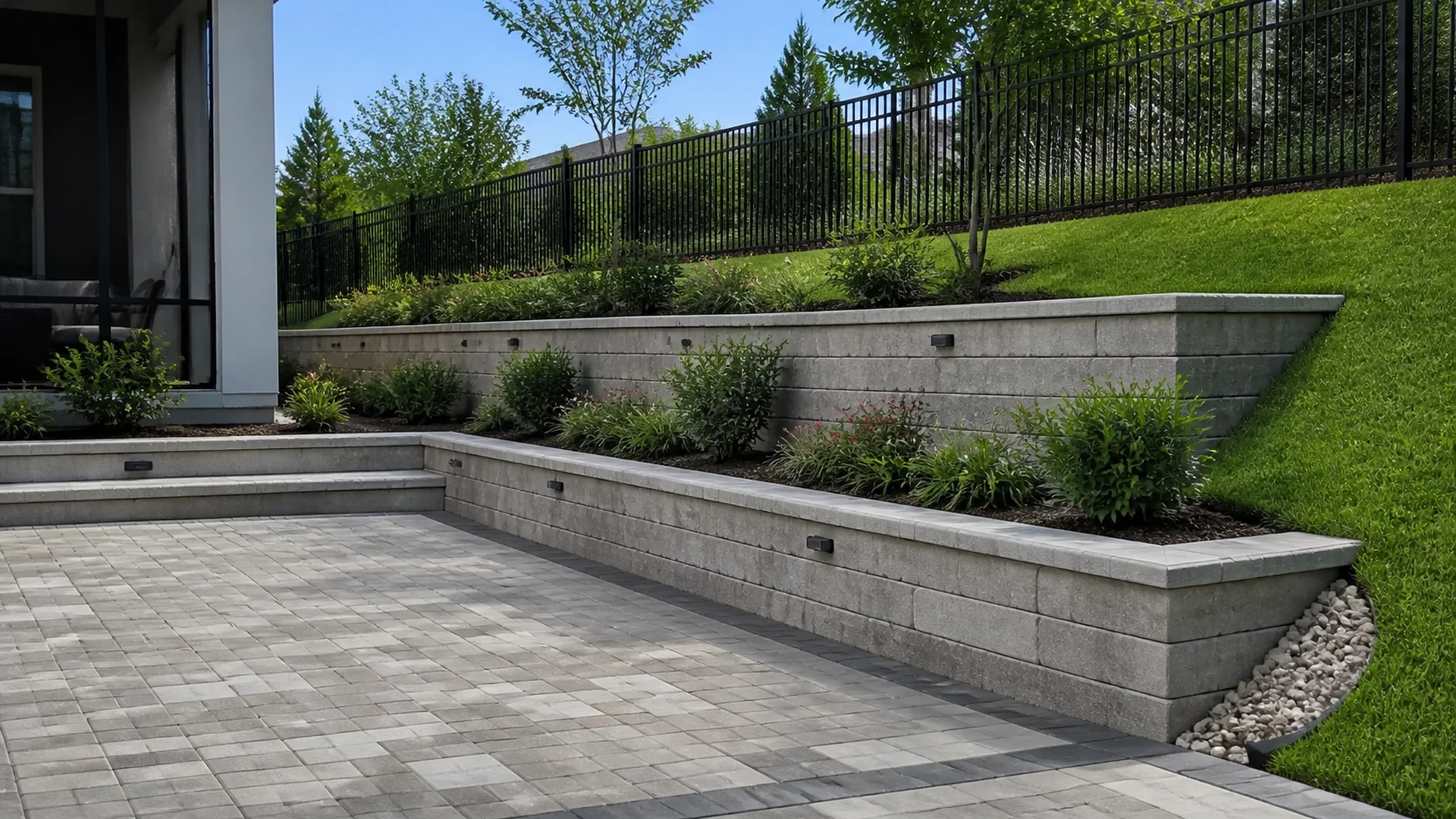
Walls, steps, and raised planters also add vertical color planes. If those features use separate products, limit the number of competing blends and identify which surface should lead. Meanwhile, cap colors can repeat a border or provide a quiet bridge to the main field. Consistency in undertone matters more than forcing every component into one exact shade.
Review availability and natural variation
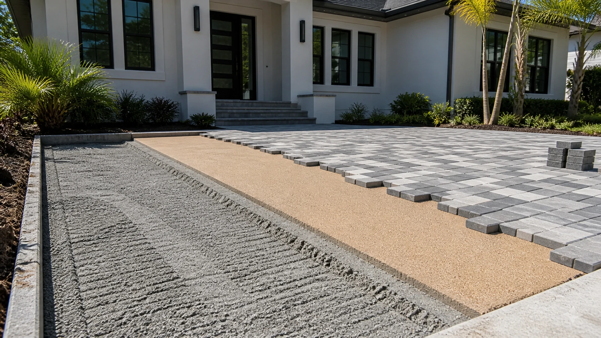
After narrowing the palette, confirm the actual product, finish, size options, and current availability with the installer. Product photographs and display boards may represent a blend without showing every possible unit. Moreover, manufacturing variation means the installed field can include a broader range than one sample. Mixing from appropriate bundles during installation helps distribute that variation across the project.
The best paver colors decision should also account for future repairs. Keeping labeled spare units from the same project can make later access work or isolated replacement easier. However, stored pieces should be protected and their product information recorded. A future batch with the same commercial name may show noticeable differences after years of production and weather exposure.
Use references as evidence, not promises
Furthermore, Completed installations provide useful scale and context, so browse comparable paver projects with attention to roof, wall, and landscape relationships. Still, screens alter color and every property has different light. The Concrete Masonry and Hardscapes Association also offers broader hardscape information. Together, references and physical samples support a more grounded discussion.
Additionally, Before approval, place the finalist samples in the planned pattern and include the proposed border. Then, view the arrangement from the most important approach and living areas. Best paver colors should feel consistent with the house in several conditions, even if their appearance shifts slightly through the day. Documenting the selected product and blend reduces ambiguity when ordering begins.
Create a short, comparable finalist list
Once the field narrows to two or three options, compare each candidate against the same criteria. Specifically, record its undertone, value, visible variation, relationship to fixed finishes, response in shade, and role beside the proposed border. This consistent review prevents one attractive feature from dominating the decision. Moreover, it gives household members a shared vocabulary for discussing differences that otherwise feel subjective.
Finally, remove any candidate that works in only one viewing condition or clashes with a permanent material. The best paver colors should support the front elevation, important outdoor rooms, and practical maintenance expectations without needing constant explanation. If two finalists remain convincing, pattern and availability may provide the deciding evidence. Consequently, the final selection reflects the whole installation rather than the most appealing loose sample.
Make the final choice with the whole property in view
Ultimately, the best paver colors connect permanent architecture, daily use, Florida light, and surrounding landscape. Start with fixed undertones, test meaningful sample areas, and review the surface from normal viewpoints. Then, refine borders, patterns, and transitions as parts of the same composition. This method produces a palette based on the actual Tampa Bay property rather than a detached color label.
Consequently, When you want help comparing the best paver colors for your property, contact DR Pavers Design, consult the FAQ, explore recent projects and homeowner testimonials, or review the available services. For more ways to connect, visit Instagram or Facebook, open the local map and Google reviews, or send the team your photos and ideas by WhatsApp, phone, SMS, or email.